You know that awkward moment when one room has to do three jobs at once: home office by day, dining area by night, guest space when family drops in? That pressure is exactly why this season’s biggest design stories feel less like decoration and more like problem-solving. A simple pine divider is suddenly a smart zoning tool. Deep red kitchens no longer read like a risky phase. Softer coastal layers are getting a more tailored update. And outside, homeowners are learning the hard way that “I’ll deal with it next weekend” is not always a safe strategy.
The common thread is surprisingly practical: the most relevant home trends right now are the ones that help your space work harder while still looking polished. If you are trying to organize a small home, refresh a tired room, or avoid expensive maintenance mistakes, these are the questions worth asking before you buy, paint, or postpone anything.
Why is a basic pine room divider suddenly such a smart home organization move?
Because open-plan living sounds generous until you actually have to live in it. One large room can quickly become visually noisy: desk clutter in the background of video calls, toy storage bleeding into the living area, workout gear parked beside the sofa. A divider gives you something many homes are missing: boundaries without construction.
The reason the current divider idea feels fresh is that it does not rely on heavy built-ins or expensive custom millwork. A simple solid-pine shelving unit, used creatively, can become a visual screen, a storage zone, and a styling moment all at once. That is a major win for renters, small apartments, and multipurpose family rooms.
Here is why this approach works so well:
- It zones a room without closing it off. You still get light and airflow, but the eye reads separate areas.
- It adds vertical storage. Baskets, books, and decorative boxes can live on the divider instead of floating around the room.
- It is flexible. You can reposition it as your layout changes, which matters if your room has to evolve with the season or your schedule.
- It looks intentional. Natural pine brings warmth, especially in spaces full of white walls, metal furniture, or builder-grade finishes.
The real design trick is not just placing a divider in the room. It is deciding what the divider should hide, frame, or support. Use it to screen a compact desk behind a living area. Place it between an entry and the main room so bags and shoes have a soft landing zone. Or use it to carve out a reading corner in a studio apartment.
Expert tip: Treat a room divider like a two-sided furniture piece, not a wall. The side facing the living room can hold books, ceramics, and low-profile storage bins. The side facing the work zone can do the harder labor: files, office supplies, tech accessories, and catchall trays. That split keeps the visible side calm and the functional side efficient.
If your surfaces tend to attract small-item clutter, even a compact accessory like an acrylic makeup organizer can help corral the bits that usually migrate onto shelves, consoles, or vanity corners. The best room dividers are only half the equation; the items on them need editing too.
Is oxblood red really a practical kitchen color, or just another short-lived trend?
It is more practical than many people expect. The surprise with oxblood red is not that it is bold. It is that it behaves almost like a neutral when used thoughtfully. It has the depth of brown, the mood of burgundy, and the richness of old-world lacquer. In the right kitchen, it can feel grounded rather than flashy.
For years, homeowners played it safe with white, greige, sage, and navy. Those shades still work, but they are no longer the only definition of a timeless kitchen. Oxblood’s rise says something bigger about where interiors are heading: people want personality back, but not chaos.
Why is this color landing now?
- It adds warmth. After years of cool-toned minimalism, deeper reds make kitchens feel more intimate and lived-in.
- It pairs well with contrast. Black countertops, aged brass, paneled details, and marble all make the color feel elevated.
- It hides wear better than stark light cabinetry. Fingerprints, scuffs, and daily mess do not show up the same way they can on bright painted finishes.
- It photographs beautifully but also works in real life. That balance matters more than ever in renovation decisions.
The mistake would be treating oxblood like a novelty accent without considering the room’s other fixed elements. If your flooring has strong orange undertones, the red can skew too warm. If your lighting is very cool, it may look flatter and harsher than intended. This is one of those colors that rewards testing. Paint large sample boards and check them in morning light, afternoon light, and evening artificial light. A deep shade can change dramatically over the course of a day.
Not ready to commit to full cabinetry? Start with one zone. A kitchen island, pantry wall, or hutch-style cabinet gives you the mood without the full plunge. If you love the result, expand later.
And yes, you can still keep the space organized. In fact, richer cabinet colors often look best when the counters are tightly edited. Fewer visible appliances, better drawer systems, and dedicated pantry categories help the room feel luxe instead of heavy. Bold color needs breathing room.
What design ideas from this summer’s collection actually make a home feel more organized?
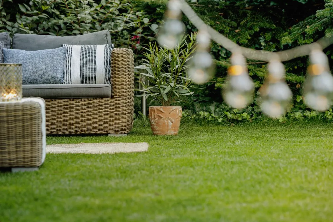
The strongest seasonal collections are not just selling objects. They are selling a mood people want to live in. This summer’s standout look leans relaxed, but not sloppy; coastal, but not theme-y; classic, but not stiff. That balance matters if you want a home that looks pulled together without feeling overdesigned.
Three ideas stand out because they translate beautifully into real rooms:
1. Soft neutrals with structure
Beige, sand, oat, and sun-faded creams are back in a big way, but the updated version uses stronger shapes to keep everything from disappearing into one blur. Think tailored sofas, plaid or patterned occasional pieces, and side tables with clear presence.
Why does this help organization? Because structured furniture visually calms a room. When every piece has a defined silhouette, the space reads more orderly even before you tidy. That is especially helpful in family rooms where throws, books, and daily life are always in motion.
2. Layered texture instead of more stuff
A woven basket, crisp stripe, washed wood finish, or nubby textile does more for a room than five random decorative objects. Texture is the secret weapon of organized-looking interiors because it creates depth without adding clutter.
If you want your shelves and tabletops to feel expensive, reduce the item count and increase material contrast. A ceramic vase, a wood bowl, and a stack of books often outperforms a crowded mix of small knickknacks. Ask yourself: do you need more decor, or better surfaces and better editing?
3. Classic patterns that hide everyday wear
Plaid, subtle stripes, and heritage-inspired motifs are having a moment again, and they are not just attractive. They are useful. Pattern can disguise minor stains, pet hair, and the visual wear that comes with heavily used spaces. That makes them particularly smart for family rooms, entry benches, and upholstered ottomans with storage.
This is where style and storage overlap. An upholstered bench in a forgiving pattern can hide blankets, toys, or seasonal accessories while making the room feel finished. A lidded basket in a beautiful weave can sit beside the sofa and hold the things you actually use every day.
Practical takeaway: When you shop summer decor, choose at least one item that works as storage and one item that adds texture. That pairing instantly improves both function and atmosphere.
What outdoor upkeep mistake is catching homeowners off guard right now?
It is not usually a dramatic landscaping failure. It is the small maintenance detail that quietly crosses a line: grass growing too tall, weeds pushing through pavers, shrubs drifting out of shape, or exterior buildup that starts to look neglected to a city inspector or HOA board.
This catches people because the yard may not look terrible to the naked eye. After a rainy stretch, growth happens fast. Miss one mowing cycle or put off edging for a week, and suddenly the property can fall outside local standards. Enforcement is based on written rules, not your personal definition of “still looks fine.”
That is where the financial sting starts. Notices often come with short deadlines. If the issue is not fixed in time, fines can follow. In some communities, they escalate. What began as a basic maintenance delay can become a bigger headache than most homeowners expect.
These are the outdoor trouble spots most often overlooked:
- Grass and weed height that exceeds local code or HOA limits
- Weeds between hardscape joints in walkways, patios, and driveways
- Overgrown shrubs blocking sightlines, sidewalks, or neighboring boundaries
- General exterior buildup on walls, fences, or visible surfaces
- Unapproved landscaping materials in communities with specific appearance rules
The lesson here is not just “mow your lawn.” It is to treat exterior maintenance as part of home organization. A home runs better when recurring jobs are scheduled before they become emergencies. Create a simple yard checklist by week and month. Put mowing, edging, trimming, and weed inspection on your calendar the same way you would a bill payment.
For busy households, grouping tasks helps. Do a 15-minute perimeter walk every weekend. Look at curb edges, pavers, fence lines, and planting beds. That tiny habit can prevent the kind of surprise violation that feels ridiculous until it hits your wallet.
How do you combine these trends without making your home feel busy or expensive?
Start by separating trend from principle. The specific looks may evolve, but the principles behind them are solid: define zones, use color with intention, prioritize texture over clutter, and stay ahead of maintenance. Those ideas are durable.
Here is a smart way to apply them room by room:
- Fix the layout first. If the room lacks function, no paint color or new decor will save it. Use shelving, screens, or furniture placement to define purpose.
- Choose one bold move. Maybe that is a deep kitchen color, a patterned accent piece, or a pine divider. One strong choice has more impact than five tentative ones.
- Edit visible storage. Baskets, trays, and lidded boxes should make life easier, but they should also reduce visual noise.
- Layer in tactile materials. Wood, linen, ceramics, woven finishes, and subtle pattern make a room feel complete without overcrowding it.
- Maintain the outside like it is part of your interior routine. Because financially, it is.
If you want your home to feel current this summer, the answer is not chasing every headline. It is noticing which ideas genuinely solve modern living problems. A divider that creates privacy. A kitchen color with real staying power. A collection that proves softness can still be structured. A yard routine that keeps minor details from turning into costly ones.
That is the shift worth paying attention to: good design is getting more useful, and smart organization is looking better than ever.