You can buy the prettiest plates, the boldest wallpaper, and even the most talked-about bedding upgrade of the season, then still end up with a home that feels slightly off. Too hot at night. Too busy in the living room. Too themed in the kitchen. The real story behind this summer’s most interesting home launches is not just style—it’s comfort calibration: the way color, pattern, texture, and temperature work together to change how your home functions hour by hour.
That is why three very different conversations are suddenly colliding in design: a historic brownstone reimagined with cinematic color and British charm, a beloved bistro-inspired tabletop collection refreshed with an Italian holiday mood, and the growing demand for cooling mattress pads and toppers that solve a practical sleep problem. On the surface, these seem unrelated. Look closer, and they point to one clear shift: people want their home to feel transportive without sacrificing usability. Beauty alone is not winning anymore.
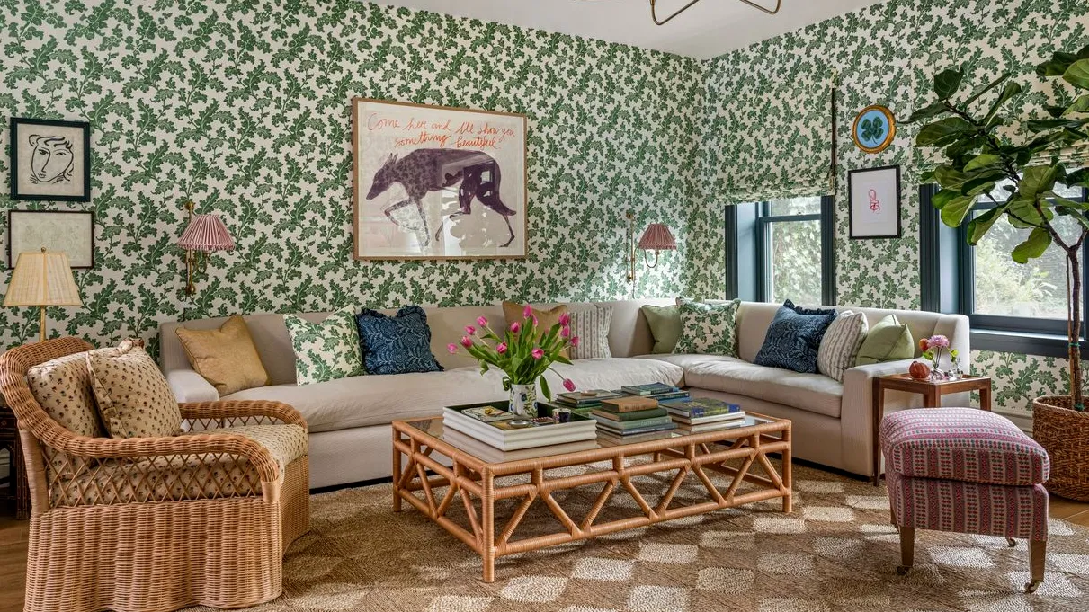
The new summer palette is layered, expressive, and less minimalist than you might expect
For years, “summer home refresh” often meant bleaching everything out—white slipcovers, pale oak, barely-there accents, maybe a lemon print if you were feeling wild. That formula is losing ground. The stronger direction now is a reimagined palette built around personality: mossy greens, tomato reds, butter yellows, tiled blues, lacquered blacks, and florals that feel a little eccentric instead of polite. Why? Because homes are being asked to do more emotional work. You do not just want a room that looks clean in daylight; you want one that feels lively when friends come over and comforting when you are stretched out on a Sunday afternoon.
“The most memorable rooms right now are not the quietest ones—they are the ones with a point of view. Color is being used less as a backdrop and more as a mood-setting tool.”
That explains the appeal of a Wes Anderson-adjacent approach to interiors: disciplined whimsy. Not chaos, not clutter, but color with intention. In practical terms, this means pairing patterned wallpaper with grounded upholstery, or using a strong rug to anchor eclectic furniture so the room still feels edited. If you love the look but worry your space will read crowded, use the designer’s trick hiding in plain sight: repeat one color family at least three times across the room. A green floral wall, olive trim, and a sage throw create continuity. A red lamp, rust piping, and a terracotta accent do the same. Repetition turns “busy” into “collected.”
Why this matters for organization, not just style
A more expressive home can go wrong fast if your everyday items are visually noisy. That is where organization becomes part of the design, not a cleanup chore after the fact. Open shelves, vanities, bedside surfaces, and drink stations all need tighter editing when the room already carries pattern and color. A few beautifully chosen objects read as intentional; fifteen small products scattered around read as stress.
One of the easiest fixes is to contain functional items in clear or tonally coordinated storage so they do not compete with the room’s palette. If your vanity or dresser is getting swallowed by little products, a slim acrylic makeup organizer can keep categories visible without adding another visual pattern to the space. In a maximalist room, transparent storage is often the smartest silent player.
Why the “Italian glow-up” trend works so well for summer hosting
The current affection for bistro motifs, hand-painted edges, tiled patterns, and sun-drenched Mediterranean color is not random. Summer entertaining has shifted away from formal tablescapes and toward setups that look generous, effortless, and a little escapist. People want the table to suggest vacation even if the gathering is just grilled vegetables on a weeknight. That is exactly why an Italian-leaning collection lands so well: it offers a familiar restaurant romance—ceramics, citrus tones, cobalt accents, market-day energy—without requiring a full kitchen renovation.
But here is the hidden reason the trend has staying power: it bridges decorative and practical needs unusually well. Tableware is one of the few seasonal home purchases that can alter the mood of a room and earn its storage footprint. A patterned pitcher, stackable dessert plates, or tiled serving pieces can make open shelving look styled while still being useful several times a week. Compare that with trend objects that eat up cabinet space and only come out twice a year. If you are trying to keep clutter under control, that distinction matters.
“The best seasonal decor is the kind that can work during normal life. If an item helps you host, stores compactly, and still adds color to the room, it earns its place.”
The organizational takeaway is straightforward: buy for display-to-storage efficiency. Choose pieces that nest, stack, or multitask. A serving bowl that doubles as fruit storage on the counter beats a decorative object that must be packed away. A striped carafe that works for water, flowers, or utensils gives you three uses from one silhouette. The collection mindset can be helpful here, but only if you resist the urge to overbuy. One complete color story on a shelf looks chic. Three competing mini-collections often look like overflow.
The most underrated summer design upgrade is the one you feel at 2 a.m.
Now for the least photogenic but arguably most impactful shift: cooling bedding. Search interest around mattress pads and toppers spikes every warm season for a reason. Heat buildup is not just annoying; it directly affects sleep quality, especially if your mattress traps warmth, your bedding skews synthetic, or your room gets late-day sun. And unlike swapping plates or repainting trim, a cooling layer changes your home experience when you are not even awake enough to admire it.
This is where many people make the wrong call. They focus on thread count or blanket weight, then ignore the thermal behavior of the mattress itself. Memory foam, for example, can retain body heat more than innerspring or hybrid constructions unless it is specifically engineered for airflow. A topper or pad can help, but the type matters. Pads are usually thinner and better for minor temperature correction; toppers are thicker and better if you also want to change the feel of the bed. If your main complaint is night sweats or a “hot back” sensation, prioritize breathable fill, moisture-wicking covers, and airflow channels over plushness claims.
Materials matter more than marketing language. Natural fibers such as cotton can help with breathability, while phase-change materials are designed to absorb and release heat as your temperature shifts. Gel-infused foams may feel cool initially but do not always sustain that effect through the night, particularly in humid rooms. If you sleep hot and your bedroom also has heavy window treatments, layered bedding, and poor circulation, no topper alone will solve the issue. The best results come from a system: breathable sheets, lighter duvet strategy, fan or air movement, and a cooling layer that matches your actual problem.
How to apply the same design logic across the whole home
What ties all of this together is a smarter way of choosing. The most compelling summer home updates are not isolated purchases; they are edits that improve both atmosphere and use. A bold palette works when storage keeps the visual field calm. A playful collection works when it is compact enough for real cabinets. A bedroom upgrade works when it addresses heat, not just appearance. Ask yourself one question before buying anything this season: Will this make the room work better, or only look more current?
If you want a practical framework, use this three-part filter. First, choose one emotional goal per room—energizing, cocooning, sociable, restful. Second, choose one dominant color or material story that supports it. Third, remove or contain anything that interrupts that story without adding function. It sounds simple, but this is the difference between a home that feels curated and one that feels crowded. Summer trends are at their best when they do not just decorate your home—they make it easier to live in.