Category: Storage Tips

Practical storage tips, decluttering guides, and step-by-step tutorials for drawers, closets, desks, and vanities.

  • Robot Mop or Living Room Refresh? Start With the Upgrade You’ll Feel

    Robot Mop or Living Room Refresh? Start With the Upgrade You’ll Feel

    You can spend four figures on a new sofa, or you can walk back into your living room after a long day and realize the bigger mood-killer was the dusty floor and visual fatigue all along. That’s the sneaky truth behind a lot of “my space needs help” moments: sometimes you need a design refresh, and sometimes you just need less grime, less clutter, and one smarter purchase.

    Robot Mop or Living Room Refresh? Start With the Upgrade You’ll Feel

    Right now, two home priorities are colliding in a very real way. On one side, people want living rooms that feel elevated, intentional, and expensive. On the other, they want less work. That’s why the real decision isn’t just whether to buy a robot mop or splurge on a luxury sofa. It’s which upgrade will improve your daily experience faster, for your budget, your layout, and your tolerance for maintenance.

    If you’re trying to decide where to put your money and effort, these are the questions that actually matter.

    Is a robot mop a better living room upgrade than buying new furniture?

    For a lot of homes, yes—especially if your current furniture is fine but the room never looks as polished as you want it to.

    A robot mop solves a low-grade, high-frequency problem. Floors collect the evidence of daily life: tracked-in dirt, pet prints, spilled coffee, kitchen dust drifting outward, and that dull film that makes even a well-decorated room look tired. When those surfaces are cleaned consistently, the whole room reads as calmer and more expensive.

    That effect is easy to underestimate. Clean floors change the way light bounces, make rugs look fresher, and reduce the contrast between “nice furniture” and “messy surroundings.” If your living room is open-concept, the payoff is even bigger because the mop is improving multiple zones at once.

    A luxury sofa, by contrast, is a high-impact aesthetic purchase but not always a high-impact quality-of-life purchase. If your current sofa is sagging, uncomfortable, or too small for the room, upgrading makes sense. But if you’re mostly craving that “my living room feels better” sensation, a consistent cleaning tool plus a no-cost styling reset can deliver a surprisingly dramatic difference first.

    The faster-win rule: if the problem is the room never looks finished, start with cleanliness and layout. If the problem is the seating is physically uncomfortable or visually wrong for the space, then furniture rises to the top.

    There’s also a math issue. A robot mop can save you repeated labor over months and years. A sofa delivers comfort and style, but it also locks you into a bigger decision: size, upholstery, cushion fill, leg height, stain resistance, and long-term wear. One is a workflow upgrade. The other is a design commitment.

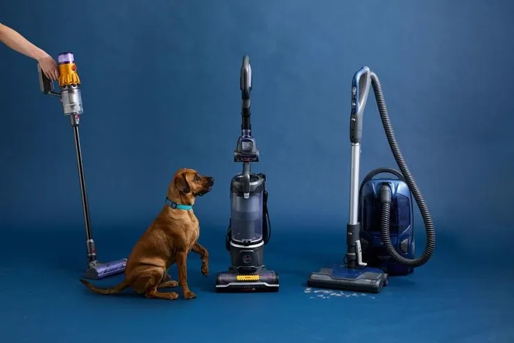
    When does a robot mop actually save time—and when is it a bad buy?

    A robot mop saves time when your home has the right conditions. It disappoints when people expect it to behave like a human doing a deep clean.

    Here’s where it tends to work best:

    • Hard flooring dominates the main level. Wood-look tile, sealed hardwood, vinyl plank, laminate, and stone all benefit from regular light mopping.
    • You deal with daily debris. Kids, pets, open-plan kitchens, and high-traffic entry paths create the kind of mess that automation handles well.
    • Your furniture has enough clearance. If a device can move freely under consoles, around coffee tables, and along open walkways, it will clean more of the room with less intervention.
    • You value maintenance cleaning over occasional marathon cleaning. A robot mop is excellent for keeping dirt from building up, which is exactly what makes a room feel consistently put together.

    And here’s when it’s a poor fit:

    • Your room is packed with obstacles. Tight side tables, low decorative stools, floor baskets, cords, and sculptural furniture can turn every cleaning cycle into a rescue mission.
    • You expect it to remove stuck-on grime on its own. Dried spills, textured tile buildup, and neglected corners still need occasional manual attention.
    • You haven’t handled floor-level clutter. This is the hidden factor people skip. A robot mop can only be “smart” if the floor is ready.

    That last point matters more than most buyers realize. If your living room floor doubles as storage for magazine stacks, pet toys, charging cables, extra poufs, and random baskets, you won’t save much time because you’ll spend it pre-cleaning the room. The better move is to simplify the floor plan first.

    Expert tip: before buying a robot mop, do a two-minute walkthrough and count the number of items you’d have to move for it to run properly. If the answer is more than five on a normal day, your first investment should be decluttering and containment—not automation.

    Small organizers can make a huge difference here. If your living room doubles as family command central, using trays, lidded baskets, and even bamboo drawer dividers in nearby media consoles can keep the overflow from creeping back onto the floor.

    Can you refresh a living room for $0 before spending on a robot mop or sofa?

    Absolutely—and you should. Free refreshes are not just for indecisive shoppers. They’re the best way to diagnose what your room is actually missing.

    When designers talk about refreshing a room for no money, they usually mean editing, rebalancing, and re-seeing what you already own. That sounds simple, but it works because most living rooms don’t need more stuff. They need fewer distractions.

    Start with these zero-cost moves:

    1. Pull furniture away from default positions. The classic example is the sofa smashed against the wall because that’s where it landed during move-in. Even shifting it a few inches, recentering a rug, or angling a chair can make a room feel intentional instead of accidental.
    2. Remove at least one-third of your visible decor. If every surface is carrying accessories, none of them read as special. Editing creates breathing room, and breathing room looks expensive.
    3. Swap decor between rooms. A lamp from the bedroom, a side chair from the office, or a tray from the kitchen can change the personality of your living room without any purchase at all.
    4. Rethink the coffee table. Too much on top makes the whole room feel busy. Keep it to a small stack, a vessel, and one sculptural or natural element.
    5. Open the sightlines. Ask yourself: what do you see first when you enter? If it’s cord clutter, overflowing shelves, or awkward furniture edges, that visual friction is the real issue.

    Why bother with this before you shop? Because it separates a styling problem from a product problem. If your room looks noticeably better after an hour of editing and rearranging, you may not need a new sofa at all. You may just need a better maintenance system and cleaner floors.

    And if the room still feels wrong after the reset, that tells you your furniture really is the bottleneck. That’s valuable information before you commit real money.

    When is a luxury sofa worth the price tag?

    A luxury sofa earns its keep when it fixes three things at once: comfort, proportion, and material performance.

    That’s the standard. Not “it looks nice in photos.” Not “everyone online seems to love this shape.” A high-end sofa is worth the price when you can feel the construction, live with the scale, and trust the upholstery to survive your actual household.

    Here’s where the splurge makes sense:

    • Your sofa is used daily for long stretches. If this is your movie seat, nap seat, reading seat, and guest seat, construction quality matters.
    • The current piece is dragging down the entire room. Oversized arms, a too-low back, flattened cushions, or poor proportions can make an otherwise nice living room feel clunky.
    • You need longevity. Better frame materials, cushion fill options, and performance fabrics can justify a higher upfront cost if replacement cycles are longer.

    But even then, be honest about the room around it. A premium sofa won’t compensate for dirty floors, visual clutter, or a bad layout. In fact, it can make those flaws more obvious. Why buy a beautiful focal point only to surround it with maintenance problems?

    If you’re sofa shopping, test these non-negotiables:

    • Seat depth: deep lounge sofas are great for sprawling, less great if your household prefers upright support.
    • Cushion composition: down-blend feels plush but often needs more fluffing; higher-resiliency foam is easier for low-maintenance households.
    • Fabric realism: order samples and check them in daylight, at night, and against pet hair if relevant.
    • Leg height and clearance: this is where furniture and cleaning intersect. More clearance can make floor cleaning easier, including for robot devices.

    That last point is underrated. If you’re choosing between two sofas and one allows easier under-sofa access, the room may stay cleaner with far less effort. Good design should support real life, not create extra chores.

    So which should you do first: buy the robot mop, refresh the room, or save for the sofa?

    Here’s the practical order for most people:

    First, do the free refresh. Rearrange, edit, remove clutter, and clear the floor. This costs nothing and gives you immediate feedback.

    Second, choose the robot mop if your room passes the layout test. If you have mostly hard floors, moderate openness, and enough discipline to keep the floor clear, it’s one of the best “my home feels better every day” purchases you can make. The value is cumulative, not flashy.

    Third, save for a luxury sofa if comfort or scale is still the problem. By then, you’ll know the upgrade is justified because you’ve already addressed the cheaper variables.

    If you want a quick decision tool, use this:

    Problem you notice most Best first move
    The room looks dusty, dull, or never quite clean Robot mop
    The room feels busy, chaotic, or visually cramped Free refresh and decluttering
    The seating is uncomfortable, worn out, or the wrong size Luxury sofa
    You keep delaying both because the floor is covered in stuff Storage reset and floor-clearing systems

    One more reality check: the smartest living room upgrade is often the one that removes friction from your week, not the one that photographs best. If your home runs smoother because the floors stay cleaner and the room looks calmer with less effort, that is design success. Isn’t that what you actually want?

    So before you fall for the drama of a major furniture purchase, make your living room work harder with less clutter, better flow, and cleaner surfaces. Then, if you still want the sofa, you’ll be placing it in a room that’s ready for it—and that means you’ll enjoy every dollar more.

  • IKEA BILLY vs Custom Built-Ins: The Smarter Living Room Storage

    Your living room can look expensive and still hide cords, stacks of books, random baskets, and the décor you are not quite ready to part with. That is the real appeal behind the current built-in look: it is not just about pretty shelves. It is about making a busy room feel intentional. But once you price true millwork, the fantasy can fade fast. So is IKEA BILLY actually the smarter storage buy, or does custom still win where it counts?

    If you are weighing a DIY bookcase wall against fully custom cabinetry, the answer is not simply about budget. It is about where you want flexibility, where you need polish, and how much effort you can realistically tolerate. Add in one more layer—a warmer, designer-led color direction that makes shelving feel less flat—and this comparison gets much more useful.

    Why this comparison matters right now

    The built-in bookcase trend has moved beyond formal libraries and luxury renovations. Homeowners are using stock shelving, paint, trim, and styling tricks to get a tailored look for way less. At the same time, warm color schemes are replacing colder gray-heavy palettes, which changes how storage walls should be finished if you want them to feel current instead of contractor-basic.

    And because more people are still working, reading, or just mentally decompressing in shared living spaces, storage has to perform double duty. It needs to look calm. It needs to hold a lot. It also helps if the room subtly supports focus rather than visual fatigue. That is where finish choice, shelf density, and even scent in the room can influence whether your setup feels energizing or cluttered.

    IKEA BILLY vs custom built-ins at a glance

    Feature IKEA BILLY Hack Custom Built-Ins
    Upfront cost Low to moderate; often hundreds to low thousands depending on scale and trim High; typically several thousand and up
    Lead time Fast if materials are in stock; install can happen over a weekend or a few phases Longer due to design, fabrication, and scheduling
    Customization Moderate; improved with trim, paint, doors, and fillers High; tailored to ceiling height, outlets, media components, and odd walls
    Look Can appear custom when properly finished Usually the most seamless and architectural
    DIY difficulty Medium to high depending on wall anchoring, trim work, and painting Low for homeowner effort if professionally installed
    Durability Good for standard use; varies with assembly and upgrades Excellent when well built with quality materials
    Best for renters or future changes Better; easier to adapt or remove than permanent millwork Worse; more permanent investment
    Fit for awkward rooms Can be tricky without fillers and hacks Excellent; made to exact dimensions
    Storage flexibility Strong; adjustable shelves are useful Strong if designed well, but less easy to reconfigure later
    Resale perception Positive if done cleanly, negative if it looks obviously pieced together Often premium if style matches the home

    Where IKEA BILLY wins

    1. Budget relief that still changes the whole room

    This is the biggest reason people keep coming back to BILLY. The math is hard to ignore. A wall of stock bookcases dressed up with trim can deliver a similar visual impact to custom built-ins for a fraction of the price. That matters when your renovation budget also has to cover paint, lighting, rugs, or a sofa that has seen better days.

    The stronger play is not using BILLY straight out of the box and hoping for the best. The smarter move is treating it as a base system. Add filler panels so the units do not float awkwardly against the wall. Extend trim to the ceiling. Paint the entire assembly in one unified shade. Suddenly the eye reads architecture, not flat-pack.

    2. Better flexibility for real-life storage

    Custom millwork sounds ideal until your needs change. Maybe your book collection shrinks. Maybe you need room for kids’ games, turntables, framed art, or baskets that hide charging cables and routers. BILLY units tend to offer practical adjustability that many homeowners underestimate.

    If your living room also stores smaller everyday items, borrow organization tactics from other zones. A nearby console or media cabinet works harder when fitted with bamboo drawer dividers, especially if remotes, adapters, pens, and note cards tend to drift across the room.

    3. Faster path to a finished room

    Custom projects are rarely just custom projects. Once cabinetry starts, you notice baseboards, dated wall color, bad outlets, overhead lighting, and uneven floors. The scope grows. BILLY hacks let you create a major transformation without signing up for a months-long chain reaction.

    Do you want the room improved this season or next year? That question alone often points buyers toward IKEA.

    Where custom built-ins still pull ahead

    1. They solve architectural problems stock units cannot

    Sloped ceilings. Off-center fireplaces. Deep media equipment. Weird radiators. Historic trim. This is where custom earns its price. A carpenter or cabinet shop can design around obstacles so the storage feels native to the house rather than cleverly inserted.

    That precision also matters if you want lower cabinets with hidden doors, integrated lighting, venting for electronics, or a bench seat under a window. You can fake some of this with hacks, but not all of it convincingly.

    2. The finish is usually more refined

    When people say they want built-ins, they often mean one thing: seamlessness. They want the shelves to look substantial, not hollow. They want the face frame proportions to feel balanced. They want the paint finish to survive years of cleaning and fingerprints. Custom tends to deliver that level of refinement more reliably.

    It also gives you better control over shelf depth. This is a quiet but important design detail. Standard bookcases can look cluttered when every object sits on the same shallow plane. Custom designs often vary depths between upper display shelves and lower concealed storage, which creates a richer, calmer visual rhythm.

    3. It can increase usable storage, not just visual storage

    Some IKEA layouts look impressive but waste perimeter inches because they need fillers, gap management, or workarounds around trim and outlets. Custom can reclaim those inches. Across an entire wall, that can mean another cabinet, deeper base storage, or cleaner cable management—small differences that feel large in daily use.

    The style factor: warm color schemes change the whole decision

    Here is where many shelving projects go wrong: the structure is good, but the color makes it look cold, flat, or dated. Designer-approved warm schemes are shifting the mood of built-ins away from bright stark white and toward tones that feel layered, grounded, and easier on the eyes.

    If you are choosing between IKEA and custom, color can narrow the aesthetic gap dramatically. A well-painted BILLY wall in a warm mushroom, soft clay, muted olive, or creamy putty often looks more elevated than a custom installation finished in a default white that clashes with the rest of the room.

    Warm shades that work especially well on bookcase walls

    • Soft greige with beige undertones: warmer than gray, but still neutral enough for books and art.
    • Mushroom taupe: ideal if you want shelves to recede and décor to stand out.
    • Muted terracotta or clay: richer and more editorial, best in rooms with good natural light.
    • Olive-leaning neutral: excellent with wood tones, black accents, and vintage décor.
    • Creamy off-white: safer than stark white and much more forgiving.

    Cause and effect matters here. Warm paint softens the grid effect of shelving. It reduces contrast, makes styling look less fussy, and helps books, ceramics, and baskets feel collected rather than crowded. That is one reason these palettes are catching on: they make storage look like décor.

    The hidden cost most buyers forget: finishing work

    When people compare IKEA to custom, they often compare product price to product price. That is not the full story. The real comparison should include finishing work.

    • Trim and filler pieces
    • Caulk and wall repair
    • Primer and paint
    • New hardware or doors
    • Anchoring and safety materials
    • Possible electrical adjustments

    A BILLY project stays affordable partly because you control how far you take the upgrade. But if you want a true custom-looking result, the details are not optional. Skipping them is usually what makes a stock solution read as temporary.

    Custom, by contrast, bundles polish into the premise. You pay more, but you are also paying to avoid the half-finished middle stage that trips up many DIY projects.

    Which option is better for focus and visual calm?

    This may sound like a side issue, but it is not. Storage walls influence mental load. Open shelving can inspire, but it can also overstimulate if every surface is packed. That matters in living rooms that double as reading nooks or part-time work zones.

    If mental fatigue is a concern, choose the option that lets you hide more of the visual noise. That may mean adding lower cabinet doors, using matching baskets, editing shelf styling, and introducing one subtle room ritual that signals reset. Many people rely on scent for this, especially energizing essential oils used sparingly near a desk or reading corner. The point is not to turn your living room into a spa. It is to make the room easier to use and easier to think in.

    Small-item clutter also builds visual static faster than people expect. If your shelving wall sits near a vanity zone, entry console, or sideboard, an acrylic makeup organizer can help contain the kinds of small products that otherwise migrate onto open shelves and tabletops.

    The smartest buyer profiles for each choice

    Choose IKEA BILLY if…

    • You want the built-in look without a premium renovation budget.
    • You are comfortable with a phased DIY project or hiring small-scale help for trim and paint.
    • Your room is fairly standard in shape.
    • You value adjustable shelving and future flexibility.
    • You are willing to spend time on styling and finishing details.

    Choose custom built-ins if…

    • Your room has architectural quirks that stock furniture cannot solve neatly.
    • You want closed storage, integrated lighting, or media planning from day one.
    • You care deeply about millwork-level fit and finish.
    • You are renovating the space more broadly and can fold cabinetry into the larger project.
    • You plan to stay in the home long enough to justify the investment.

    Expert tip: make stock shelving look intentional, not improvised

    If you go the IKEA route, use this formula: fewer visible seams, fewer finish changes, fewer random objects. That means lining units up wall to wall when possible, painting bookcases and trim the same color, and limiting shelf décor to repeatable categories like books, boxes, ceramics, and framed art. The more consistent the rhythm, the more custom it reads.

    Also pay attention to shelf spacing. Too many evenly spaced shelves can make a unit feel generic. Varying what you place on each level—horizontal book stacks, one taller vase, one lidded basket—creates the visual hierarchy custom installers often build in structurally.

    The bottom line for a stylish, organized living room

    If your goal is maximum transformation for the money, IKEA BILLY is the stronger buy. It offers enough storage, enough flexibility, and enough design potential to mimic built-ins surprisingly well when finished properly. That is exactly why so many homeowners are choosing it as a practical alternative rather than a compromise.

    But if your room has awkward dimensions, your tolerance for DIY is low, or you want cabinetry that feels truly permanent and architectural, custom built-ins still justify their premium. The smartest move is not asking which option is universally better. It is asking which one solves your room better.

    Start with your wall dimensions, your must-hide items, and your preferred color temperature. Then price the full project—not just the shelving. That is the comparison that will actually save you money, time, and regret.

  • Kitchen Mistakes Ruining Your Cast Iron and Crispy Potatoes

    Kitchen Mistakes Ruining Your Cast Iron and Crispy Potatoes

    You heat the pan, add oil, wait for that dramatic sizzle—and somehow dinner still sticks, burns, or turns patchy. Then the potatoes come out browned in spots but not truly crisp, while your kitchen still feels visually off because the room itself is fighting you. Annoying? Very. The surprising part is that these problems often come down to a few small choices: the wrong oil, the wrong burner setup, and a kitchen design mindset that treats function and style as separate things.

    Kitchen Mistakes Ruining Your Cast Iron and Crispy Potatoes

    Right now, the kitchen conversation is moving in two directions at once: better cooking performance and warmer, more natural-looking design. That means practical upgrades matter more than ever, whether you’re rescuing a cast iron skillet, trying a smarter roasting trick, or rethinking a black-and-brown palette around an island. If you want a kitchen that works harder and looks more considered, these are the questions worth asking.

    Why does cast iron fail even when you think you’re using it correctly?

    The biggest cast iron frustration is that people blame the pan when the setup is really the issue. Cast iron is heavy, slow to heat, and excellent at retaining heat—but that doesn’t mean it heats evenly in an instant. If you place it over a burner ring and crank the heat, you create a hot center before the rest of the surface catches up. That “heat ring” effect is a major reason food sticks in one spot and scorches in another.

    The fix is simple, but not always intuitive: preheat longer and lower. Give the pan several minutes over medium or medium-low heat so the whole cooking surface can warm more evenly. Then add your fat and wait until it looks fluid and lightly shimmering instead of aggressively smoking. A ripping-hot center with cool outer edges is not good searing—it’s uneven cooking disguised as confidence.

    There’s also a seasoning misconception that causes trouble. Many home cooks reach for oils they already keep on the counter, especially olive oil, without thinking about smoke point or polymerization. For seasoning cast iron, low smoke point oils can become tacky, uneven, or more likely to burn before they build that durable finish you actually want.

    The better approach: use a higher smoke point oil for seasoning and apply far less than you think you need. Wipe on a whisper-thin layer, then buff off the excess until the pan almost looks dry. Thick oil layers don’t create stronger seasoning; they create sticky buildup.

    • Preheat slowly: 4 to 6 minutes on moderate heat is often better than 90 seconds on high.
    • Season lightly: excess oil is one of the fastest ways to get blotchy results.
    • Match pan size to burner: if the burner is too small, the center will always run hotter.
    • Use the oven when needed: for large skillets, oven preheating can improve overall heat distribution.

    If your skillet has been disappointing you, don’t replace it yet. Most cast iron problems are technique problems, not product failures.

    Which oil should you use for seasoning cast iron—and which should stay off the pan?

    If your goal is a durable, smooth seasoning layer, high smoke point oils are the smarter pick. They tolerate heat better and are more likely to form the hard, bonded coating that makes cast iron feel naturally nonstick over time. This is why many cooks get better results when they swap out lower smoke point pantry favorites for more heat-stable options.

    That doesn’t mean olive oil is “bad” in every kitchen use. It just means it’s not the ideal choice for every cast iron task, especially seasoning. For building and maintaining the finish, a neutral oil with a higher smoke point generally gives you a more reliable result.

    What matters just as much as the oil itself is the method:

    1. Wash and fully dry the pan.
    2. Warm it slightly so oil spreads in a thinner film.
    3. Rub in a very small amount of high smoke point oil.
    4. Buff thoroughly with a clean cloth or paper towel.
    5. Heat until the coating sets, not until it pools or smokes violently.

    Think of seasoning as a storage and maintenance habit, not a rescue mission. A pan that’s cleaned promptly, dried completely, and stored in a low-moisture spot will hold its finish much more easily. If your kitchen tends to collect overflow tools and random cookware lids, tightening up that zone helps more than people realize. A calmer cabinet setup makes it easier to keep cast iron accessible, dry, and used regularly instead of buried under clutter.

    For kitchens that need more structure overall, adding systems like closet organizers in adjacent pantry or utility areas can free up cabinet space for heavier cookware and reduce the pileup that leads to chipped seasoning and awkward stacking.

    Can mayonnaise really make roasted potatoes crispier than oil or butter?

    Odd as it sounds, yes—used correctly, mayonnaise can produce deeply crisp roasted potatoes. Why? Because mayo is essentially a ready-made emulsion of oil and egg, and that combination can coat potatoes more evenly than a quick drizzle of oil alone. The coating encourages browning and helps create a crisp exterior while the inside stays fluffy.

    This does not mean you should drown the tray in mayonnaise. A light coating is the whole point. Too much, and you get heaviness instead of crunch. The sweet spot is just enough to slick the surface of the potatoes so they roast rather than steam.

    Here’s where this trick shines:

    • On rough-edged potatoes: parboiled or shaken potatoes grab the mayo coating especially well.
    • At higher roasting temperatures: strong oven heat helps develop color and texture.
    • When you want consistency: the emulsion distributes fat more evenly than uneven pats of butter.

    A practical method that works: parboil the potatoes until the edges are tender, drain well, rough them up in the pot, then toss with a modest spoonful of mayonnaise plus salt, pepper, and any dry seasonings you like. Roast on a preheated tray so the bottoms start crisping immediately. That preheated surface matters more than many recipes admit.

    And yes, this is one of those kitchen tricks that sounds gimmicky until you try it. But the logic is solid. Better surface coverage equals better browning. Better browning equals potatoes you actually want to eat straight from the pan.

    If your cooking tools are jammed into one overstuffed drawer, though, even easy upgrades become harder to repeat. A kitchen that supports good cooking habits is one where your sheet pans, spatulas, and prep tools are easy to grab. Well-planned drawer organizers can make that nightly setup faster, especially in smaller kitchens where one messy drawer slows down the whole room.

    Does black and brown really work in kitchen design, or is it a styling risk?

    It works—and increasingly, it looks like the kitchen color pairing to watch. For years, many homeowners treated black and brown as competing neutrals. But warmer kitchens are back, and the contrast between black accents and natural wood tones feels more layered, more lived-in, and frankly more expensive than the all-white or all-gray formulas that dominated for so long.

    The key is balance. Black gives structure. Brown brings warmth. When those elements meet around a kitchen island, the room starts to feel grounded instead of flat. A natural wood island paired with black details—think stools, pendants, cabinet hardware, or window frames—creates contrast without making the space feel stark.

    Why this pairing works so well now:

    • It softens modern kitchens: black can read severe on its own; wood keeps it approachable.
    • It hides wear better: natural materials and darker accents are often more forgiving than pale monochrome finishes.
    • It layers beautifully: stone, matte metal, woven textures, and ceramics all sit comfortably in the mix.

    If you’re nervous about trying the look, start with the island. It’s the easiest place to introduce wood tone without redesigning the entire kitchen. A wood or wood-look island against black fixtures instantly shifts the room toward that warmer, more tailored style. Add a bowl of produce, a linen runner, or a couple of timber cutting boards, and the palette starts to make sense.

    One caution: don’t mix random browns. Choose a dominant wood tone—light oak, walnut, or medium natural wood—and repeat it deliberately. That’s what makes the room feel designed instead of accidental.

    What’s the smartest kitchen upgrade if you want both better cooking and better organization?

    Don’t start with a full remodel. Start with the friction points you notice every week. Is your cast iron seasoning failing because the pan is shoved into a damp lower cabinet? Are your sheet pans buried behind serving platters? Do you avoid roasting because the right tools are too annoying to reach? Those are organization problems disguised as cooking problems.

    The most effective kitchen upgrade is usually a combination of three small shifts:

    Problem What causes it Smart fix
    Food sticks in cast iron Heat ring, rushed preheating, wrong oil Lower preheat, high smoke point oil, proper burner match
    Potatoes roast unevenly Poor coating, cold tray, overcrowding Use a light mayo coating, preheat tray, space potatoes out
    Kitchen feels cold or flat Too many hard finishes, no tonal warmth Add a natural island tone with black accents
    Cooking feels chaotic Cluttered storage and hard-to-reach tools Rework drawers, cabinets, and overflow storage zones

    If you want one expert-level rule to keep, make it this: treat your kitchen like a workflow, not a showroom. The pan needs the right heat. The potatoes need the right coating. The island needs the right contrast. And your storage needs to support all of it.

    That’s the real through-line here. The best kitchens aren’t just beautiful, and they aren’t just efficient. They remove tiny, repeatable mistakes before those mistakes become nightly frustration. Once you switch the oil, control the heat ring, and embrace warmer materials, the room starts working with you instead of against you. Isn’t that the whole point?

  • Should You Raise Your Dishwasher? A Kitchen Layout Guide

    Should You Raise Your Dishwasher? A Kitchen Layout Guide

    You don’t notice a badly placed dishwasher all at once. You notice it in tiny, annoying moments: the bend to grab a cereal bowl, the blocked walkway when the door is down, the awkward shuffle around someone unloading plates while you’re trying to get to the fridge. It feels normal because most kitchens are built this way. That does not mean it’s the best setup.

    Should You Raise Your Dishwasher? A Kitchen Layout Guide

    Right now, one of the smartest kitchen layout decisions isn’t a bigger island or more open shelving. It’s much more specific: whether your dishwasher should stay under the counter or move up into a tall cabinet at a more ergonomic height. If you’re renovating, building, or trying to avoid expensive layout regret, this is the comparison that matters.

    This is ultimately a buyer decision, not a trend piece. An elevated dishwasher can be brilliant, but only in the right kitchen. Get the spacing wrong, and you trade one daily frustration for another.

    Under-counter vs elevated dishwasher: the real comparison

    The classic under-counter dishwasher wins on familiarity, simpler installation, and lower upfront complexity. The elevated dishwasher wins on comfort, visibility, and a smoother daily workflow. The smartest choice depends on your kitchen width, cabinet plan, and how much you value ergonomics over standard placement.

    Feature Under-counter dishwasher Elevated dishwasher
    Typical position Installed below a 90–92 cm countertop, usually beside the sink Integrated into tall cabinetry with base starting roughly 40–60 cm above floor
    Ergonomics Requires repeated bending to reach lower rack Lower rack sits closer to waist level, reducing strain
    Top rack visibility Moderate; often requires leaning forward Much easier to see and unload near chest height
    Impact on traffic flow Door extends about 60 cm into walkway and can block circulation Still opens outward, but raised position often feels less intrusive in use
    Best clearance aisle 100 cm minimum, 105–120 cm more comfortable Also benefits from 105–120 cm, especially near tall cabinet runs
    Plumbing simplicity Easier and more conventional More planning required for water, drain, and electrical placement
    Cabinet design impact Fits standard base cabinet layouts Requires tall cabinet integration and more deliberate visual planning
    Best for Budget-conscious remodels, smaller kitchens, standard layouts Aging-in-place design, ergonomic kitchens, high-function custom remodels
    Main drawback Repetitive bending and blocked pathways Less standard, can reduce flexibility in tall-storage planning

    Why the standard dishwasher placement feels more irritating over time

    Most people accept the under-counter dishwasher because it sits near the sink and fits the plumbing logic. Fair enough. But daily use tells a different story.

    In a standard setup, the dishwasher occupies one of the lowest work zones in the room. The lower rack often sits only around 20–30 cm above the floor when pulled out. That means every plate, lunch container, mug, and pan asks your body to repeat the same forward bend. Once or twice? Fine. Every day for years? Less fine.

    The bigger issue is that this isn’t a dramatic flaw. It’s a low-grade friction point. Those are the design mistakes that wear on you the most because they never fully disappear.

    If your kitchen already feels crowded, the open dishwasher door makes things worse. In tighter layouts with around 90 cm between cabinets and island, an open appliance door can turn the whole room into a one-person lane. That’s not just inconvenient; it changes how confidently you use the kitchen.

    What an elevated dishwasher actually improves

    Raising the dishwasher doesn’t sound revolutionary on paper, but in practice it can change the rhythm of the room. The big win is ergonomic access. The lower rack moves up toward waist level instead of hovering near your shins, and the top rack becomes genuinely visible rather than something you peer into while stooping.

    This matters even more if you unload dishes every day, batch cook often, or share the kitchen with family members who are constantly moving through it. Why keep one of the most-used appliances in the least comfortable zone?

    There’s also a visual advantage. When the appliance is integrated into a tall cabinet wall, it reads as part of the architecture rather than another interruption in the lower run of cabinets. In well-designed kitchens, especially those with darker wood finishes or matte fronts, this can look cleaner and more intentional.

    That same logic is why people increasingly think hard about internal storage planning too. A kitchen that saves your back but wastes every interior inch still misses the point, which is why tools like drawer organizers often end up being as important as the cabinetry itself.

    When an elevated dishwasher is the better buy

    An elevated dishwasher makes the most sense in a few specific scenarios.

    1. You’re planning a custom kitchen from scratch

    If your cabinetry isn’t locked in yet, this is the moment to consider it. Moving the dishwasher into a tall unit is much easier when the full kitchen is being designed together. You can coordinate plumbing, electrical, door swing, and storage around it instead of trying to wedge the idea into an existing plan.

    2. You want an aging-in-place kitchen

    This is one of the most convincing reasons to do it. A raised dishwasher reduces repetitive bending and makes dish loading more manageable for older adults or anyone with back, hip, or knee issues. Universal design is often framed as medical-looking or overly specialized, but this is a rare upgrade that feels sleek and practical at the same time.

    3. Your kitchen has enough clearance to support it

    For comfortable movement, aim for 105–120 cm between opposing runs or between cabinetry and island. A 100 cm aisle can work. Once you drop below 95 cm, open doors and drawer fronts start turning everyday kitchen tasks into traffic management.

    That spatial logic applies across the home. Whether you’re planning a pantry wall or a cabinet for clothes in a small bedroom, the hidden question is always the same: can the storage open fully without making the room harder to use?

    4. You value daily comfort more than strict convention

    Some homeowners hesitate because the setup feels unfamiliar. But unfamiliar is not the same as impractical. The elevated dishwasher is one of those choices that can seem odd in a showroom and completely obvious after a month of living with it.

    When you should stick with a standard under-counter dishwasher

    Not every kitchen should chase this upgrade. There are good reasons to stay conventional.

    Small kitchens with limited tall storage

    If you only have one tall cabinet wall, sacrificing prime vertical storage for a dishwasher may not be worth it. You might need that real estate for pantry pull-outs, brooms, food storage, or integrated refrigeration. In compact kitchens, storage hierarchy matters.

    Tight budgets or simple replacement projects

    If this is a straightforward appliance swap rather than a whole redesign, keeping the dishwasher where the plumbing already exists is usually the smarter financial move. Relocating it can trigger added cabinetry costs, finish work, and utility rerouting that make a modest remodel feel custom-priced very quickly.

    Homes prioritizing resale-safe familiarity

    While elevated dishwashers are increasingly appreciated in design-forward kitchens, the under-counter version is still the default expectation for many buyers. That doesn’t mean you should avoid an elevated model, only that resale strategy may push you toward standard if your market is conservative.

    The clearance measurement you should not ignore

    If you remember one spec from this entire decision, make it this one: aisle width.

    • 100 cm: minimum functional clearance
    • 105–120 cm: comfortable daily-use clearance
    • Below 95 cm: likely to feel cramped once appliance doors and drawers are open

    This matters because even a beautifully placed dishwasher fails if the surrounding circulation doesn’t work. A raised appliance does not cancel the physics of an open door. You still need enough room to unload without pinning another person against the island.

    Expert tip: don’t just measure cabinet-to-island distances on paper. Mock up the open door depth and drawer extensions with painter’s tape on the floor. It’s a simple test, and it catches layout mistakes before they become expensive millwork.

    How this compares to other “small” kitchen upgrades

    People often obsess over countertop materials and cabinet colors because they’re visible. But the upgrades that change your kitchen life are usually the ones you feel, not the ones you photograph.

    An elevated dishwasher belongs in the same category as better drawer planning, deeper pantry pull-outs, or smarter interior zoning. It’s a functional decision masquerading as a layout tweak. And unlike trend-heavy choices, it keeps paying you back every single day.

    That’s also why storage planning should happen alongside appliance placement. If you move the dishwasher up, you may need to rethink where dishes, glassware, or kids’ lunch supplies live so unloading stays efficient. Sometimes the best companion upgrade is simply better containment using closet organizers principles applied outside the closet: categories, zones, and easy reach.

    A practical decision checklist before you commit

    If you’re debating the move, ask yourself these questions:

    1. Do you unload the dishwasher frequently enough to care about bending strain?
    2. Can your kitchen maintain at least 100 cm of clear circulation, ideally more?
    3. Do you have enough tall cabinetry space to absorb the appliance without hurting storage?
    4. Are you already doing custom cabinetry or utility work?
    5. Would improved accessibility matter for kids, aging parents, or your future self?

    If you answered yes to most of those, an elevated dishwasher deserves serious consideration.

    If you answered no, the standard placement may still be the right choice, but you should optimize around it: protect aisle width, keep everyday dishes close by, and avoid pairing the dishwasher with storage choices that force even more crouching.

    The smartest takeaway for a real-life kitchen

    The better dishwasher placement is the one that supports your body, your storage plan, and your room’s circulation all at once. For many households, that will still be a well-positioned under-counter model. For others, especially in a new custom kitchen, raising the dishwasher is the kind of layout decision that quietly fixes a problem you thought you had to live with.

    And that’s the real test of good design, isn’t it? Not whether it looks clever in a rendering, but whether the room works better every ordinary Tuesday night when you’re unloading plates and trying not to trip over the door.

  • The EMF Fridge Method That Cuts Clutter Without a Kitchen Reset

    The EMF Fridge Method That Cuts Clutter Without a Kitchen Reset

    You do not need a matching set of bins, a Sunday meal-prep ritual, or a full kitchen overhaul to make your refrigerator feel under control. Sometimes the fix is much smaller: changing the order in which you place food so your fridge works like a room with zones instead of a cold box where leftovers go to disappear. That is why the EMF rule has been catching attention. It is simple, visual, and surprisingly effective if your biggest fridge problem is not lack of space, but lack of structure.

    The EMF Fridge Method That Cuts Clutter Without a Kitchen Reset

    The idea lands at a moment when home organization advice is moving in two directions at once. On one side, people want fast systems that do not require buying ten products. On the other, they still want their spaces to feel intentional and calm, the same way a well-layered living room does. Even entertainment news has been reinforcing the same lesson: plans shift, schedules change, and the households that stay sane are the ones with systems flexible enough to absorb surprises. Your fridge should be one of those systems.

    What is the EMF fridge rule, exactly?

    EMF is a simple organizing sequence for how food should be arranged so it gets used instead of forgotten. While people interpret the letters slightly differently, the core idea is consistent: place the most urgent, visible, and likely-to-expire foods where your eyes land first, and move long-life or backup items into less prominent zones. In practice, EMF is less about alphabet soup and more about a hierarchy of access.

    Think of it this way: your refrigerator has prime real estate and dead zones, just like a living room has focal points and neglected corners. The center shelf at eye level gets attention. The very back of a lower shelf does not. If berries, herbs, opened yogurt, cooked grains, or last night’s pasta vanish into low-visibility spots, you will probably rebuy what you already own or throw out what you meant to eat.

    A practical EMF interpretation looks like this:

    • E = Eat first: leftovers, cut produce, open dairy, prepared lunches, half-used sauces nearing the end of their life.
    • M = Middle-term: foods you will use this week but not necessarily today, such as eggs, cheese blocks, sandwich fillings, washed greens, and breakfast staples.
    • F = Future stock: backup jars, unopened condiments, extra tortillas, spare butter, and other longer-lasting items.

    That structure works because it matches real behavior. Most people scan quickly, grab what is easiest, and shut the door. A fridge system that depends on memory is a weak system. A fridge system that creates visual cues is much stronger.

    Why does this method work better than just “tidying the fridge”?

    Because tidying is cosmetic, while EMF is behavioral. A neat refrigerator can still be a wasteful one if the wrong foods are hidden in the wrong places.

    Many organizing mistakes come from treating all items as equal. They are not. A sealed bottle of mustard does not need the same visibility as a container of cooked chicken you need to eat by tomorrow. Once you organize by urgency instead of by product category alone, your fridge starts helping you make better decisions.

    Here is the chain reaction the EMF method creates:

    1. Visible food gets eaten sooner. That lowers spoilage.
    2. Lower spoilage reduces duplicate shopping. You stop buying another carton of spinach because you forgot one was hiding behind juice.
    3. Less duplication frees shelf space. Suddenly the refrigerator feels bigger without actually being bigger.
    4. More space makes cleanup faster. Wiping shelves and checking expiration dates becomes less of a project.

    There is also a mental benefit. When your fridge is laid out by “use next” rather than “store wherever it fits,” dinner decisions become easier. You open the door and immediately see what should be cooked. That is not just organization; that is decision-fatigue reduction.

    If you love interiors, you already know that good design guides movement. A bohemian living room, for example, looks relaxed but still relies on intentional layering, balance, and easy flow. Fridge organization is the same. It should feel effortless because the planning happened upfront.

    How should you set up your shelves using the EMF approach?

    Start with the foods you routinely waste. Not the foods you buy most often, and not the foods that photograph well in clear bins. What actually goes bad in your house? That is your clue.

    For many households, the top offenders are leftovers, berries, bagged greens, fresh herbs, deli meat, and open condiments. Those belong in the easiest-to-see places.

    A smart shelf-by-shelf setup often looks like this:

    Fridge Zone Best Use Why It Works
    Eye-level shelf Eat-first foods, leftovers, prepped meals This is the highest-visibility area, so urgent items stay front of mind
    Upper shelf sides Breakfast staples, lunch items, grab-and-go snacks Easy access supports daily routines
    Middle shelf Ingredients for this week’s meals Keeps active ingredients together without hiding them
    Lower shelf Raw proteins in secure containers Safer placement and less drip risk
    Crisper drawers Produce with proper humidity needs Best for storage longevity, but label mentally so it is not forgotten
    Door Condiments, drinks, low-risk items Warmest zone, better for stable products than delicate perishables

    One expert-level tweak: create a visible “use next” strip on your main shelf. It can be as simple as one narrow tray that holds the three to five items that need immediate attention. This is where EMF becomes especially powerful. Instead of scanning twenty things, you scan five. That is a small shift with a big payoff.

    And yes, containers help, but only if they support the system rather than complicate it. Shallow bins prevent food from getting buried, and labels can reinforce what belongs where. If you are already using kitchen drawer organizers for utensils or wraps, apply the same logic here: every item should have a visible, logical home, not just a random place it happened to fit.

    What are people most likely to get wrong when trying the EMF method?

    The biggest mistake is turning a flexible system into a rigid one. Your fridge is not a showroom. It is a working part of your home.

    Here are the most common EMF failures:

    • Overbuying containers before fixing the layout. Products cannot solve a bad zone plan.
    • Hiding perishables in drawers without a reminder system. Out of sight often means out of mind.
    • Giving unopened backup items premium shelf space. Reserve the best spots for what needs action now.
    • Ignoring household habits. If your kids always grab yogurt from one shelf, put yogurt there instead of fighting behavior every day.
    • Keeping mystery leftovers too long. If you cannot identify it quickly, it should not be taking up prime space.

    Another mistake? Organizing by aesthetic fantasy instead of real life. Maybe you love the look of a pared-back fridge with only glass jars and color-coordinated produce. But if you rely on packaged snacks, meal starters, and busy-week shortcuts, your system needs to support that reality. An organizing method only sticks when it matches how you actually live.

    Ask yourself one honest question: when you open your fridge at 6:30 p.m., can you tell what should be eaten first in under five seconds? If the answer is no, your setup is probably too decorative or too vague.

    Can the EMF rule make a small fridge feel bigger?

    Yes, and not because it magically creates cubic footage. It works because it reduces wasted space caused by duplication, forgotten food, and bad visibility.

    Small refrigerators become chaotic fast when every category is mixed together. A half jar of salsa sits in front of an unopened one. A lunch container blocks produce. Cheese wedges drift between shelves. Before long, you cannot see what you have, so the fridge feels full even when a lot of that volume is disorganized air and expired food.

    EMF helps a smaller fridge in three concrete ways:

    1. It shortens inventory time. You spot use-first items immediately.
    2. It reduces backups. You stop storing duplicates where they crowd active food.
    3. It supports faster resets. A five-minute weekly shelf check is usually enough when zones are clear.

    This is especially helpful in apartments and smaller kitchens, where the refrigerator often has to do more with less. The same design instincts that make compact living rooms feel layered instead of cramped also help here: keep essentials visible, use vertical space wisely, and avoid letting one category sprawl across the whole footprint.

    If you want a simple maintenance rhythm, try this:

    • Daily: move any newly opened or nearly finished item into the eat-first zone.
    • Twice a week: check leftovers and cut produce.
    • Before shopping: scan the future-stock area so you do not buy what you already have.

    That is it. No color-coded spreadsheet. No three-hour Sunday reset.

    The beauty of the EMF method is that it respects real life. Plans change. Schedules move. Dinner gets delayed. Guests drop by. Your fridge should still tell you what matters most at a glance. When it does, you waste less, cook more confidently, and gain back the kind of order that actually feels useful rather than performative.

    Try the method once, then tweak it around your habits. Put urgent foods where your eyes naturally land, push backups out of the spotlight, and keep one visible use-next zone active at all times. That single shift is often enough to make the whole kitchen feel calmer.

  • Pet Hair Is a Storage Problem First—Here’s the Cleaning Fix

    Pet Hair Is a Storage Problem First—Here’s the Cleaning Fix

    You can buy a powerful vacuum, run it every day, and still feel like pet hair is winning. It gathers under the sofa, clings to throw pillows, drifts into closet corners, and somehow ends up inside drawers that never seem to stay shut for long. That is the part many people miss: pet hair is not only a cleaning issue. It is also a home organization issue, because fur collects fastest where storage is crowded, surfaces are over-decorated, and fabrics are doing too much work.

    Pet Hair Is a Storage Problem First—Here’s the Cleaning Fix

    The most useful takeaway from recent expert recommendations on vacuums for pet hair is not simply which model has the strongest suction. It is that pet-hair cleanup works best when your home is arranged to make that suction effective. At the same time, the broader lifestyle cues showing up elsewhere—from a major royal exhibition centered on wardrobe preservation to renewed interest in timeless, tranquil outdoor design and even practical expert advice about making vegetables more appealing—point to the same thing: good systems beat good intentions. Whether you are protecting clothing, maintaining a serene room, or trying to make healthy habits stick, the environment matters. Your home either helps your routine or quietly sabotages it.

    The real pet-hair problem starts where clutter traps it

    Experts consistently favor vacuums that can handle multiple surfaces well: carpets, hardwood floors, upholstery, and tight edges where fur accumulates in dense little drifts. That detail matters because pet hair rarely stays politely in one zone. It migrates. A rug sheds it onto baseboards, the dog bed spreads it to the hallway, and a fabric dining chair turns it into an all-day visual nuisance. If your rooms are packed with baskets on the floor, open shelving lined with soft goods, and decorative textiles that are hard to shake out, even a top-rated vacuum has to fight your layout first.

    “The best vacuum for pet hair is the one you can actually use quickly, on every surface where fur lands,” one recurring expert principle suggests. “Attachments, brush-roll design, and maneuverability matter because pet hair hides in transitions—between rug and floor, cushion and armrest, wall and cabinet.”

    That is why the smartest pet homes often look slightly edited rather than merely spotless. Fewer floor obstacles mean better cleaning passes. Closed storage means fewer places for floating fur to settle. Washable covers outperform precious fabrics that trap hair and resist maintenance. If your entry bench stores leashes, towels, and grooming tools behind doors instead of in open bins, you reduce visual noise and the amount of lint-like debris circulating through the room.

    Why wardrobe and linen storage deserve more attention

    Pet owners often focus on visible mess and ignore secondary contamination: the fur that transfers from the sofa to your sweater, from your sweater to the closet, and from the closet to freshly laundered items. The renewed focus on curated wardrobe presentation in major exhibitions is a useful reminder that clothing lasts longer and looks better when stored intentionally. When garments are crammed together, hair clings more easily and cleaning becomes reactive instead of preventive.

    If your closet constantly picks up stray fuzz, you may need less exposed fabric and better compartmentalized storage—not just more lint rollers. A well-plioritized cabinet for clothes can protect folded knits, pet-free guest linens, and seasonal items far better than open stacks on a shelf. The point is not to make your home feel precious. It is to create zones: high-contact pet spaces, easy-clean family spaces, and protected storage spaces where hair should not be drifting in at all.

    Vacuum choice matters, but only if it matches your floor plan

    Comparison-style vacuum advice is most helpful when you stop asking, “Which one is best?” and start asking, “Best for what?” Homes with large area rugs and shedding dogs need deep agitation and a brush roll that does not tangle constantly. Small apartments with hard flooring need edge cleaning, light weight, and easy emptying. Multi-level homes benefit from cordless flexibility, provided the battery lasts long enough for a realistic full pass. Upholstery-heavy spaces need a motorized hand tool that can pull fur from sofas rather than just skim the surface.

    That practical matching process is where many buyer decisions go wrong. People overbuy suction and underbuy usability. A heavy machine with great reviews is still the wrong vacuum if you avoid carrying it upstairs. A sleek cordless model is still the wrong one if your dog sheds enough to fill the bin halfway through the living room. The strongest purchase is the one that fits your actual traffic pattern, surface mix, and tolerance for maintenance.

    “Pet-hair cleaning is a systems problem, not a hero-product problem,” is the lesson cleaning professionals return to again and again. “If the vacuum is hard to maneuver, the bin is annoying to empty, or the brush tangles after every use, you will clean less often—and hair will spread into storage, textiles, and corners that are harder to reset later.”

    One overlooked tip: map your hair hotspots before you buy. Spend three days noticing where fur visibly collects by evening. Is it under dining chairs? Around air vents? Along the edge of a low-pile rug? On the bed skirt? That audit tells you whether you need strong edge tools, anti-tangle rollers, upholstery power, or simply a vacuum light enough to use daily. And if your bedroom storage is constantly catching lint, integrating a neater drawer for wardrobe setup can keep clean items separated from the fabrics your pet touches most often.

    A calmer room is easier to keep clean

    There is a reason timeless, tranquil interiors continue to resonate. Calm spaces are not just pretty; they are operationally better. Think about the enduring appeal of a balanced garden or a carefully arranged exhibition: each element has room to breathe. In home terms, that means fewer fussy surfaces, stronger material choices, and a layout that does not force dirt and fur to hide in decorative excess. Pet-friendly design is often less about sacrificing style and more about choosing style that can survive real life.

    That might mean tighter-weave upholstery instead of fuzzy bouclé, elevated furniture that allows quick vacuum passes underneath, and washable slipcovers in colors that disguise light shedding between cleanings. It can also mean rethinking your soft storage. Floor baskets look charming until they become fur magnets. Open blanket ladders photograph well until every throw needs constant shaking. If your goal is a cleaner-feeling home, the answer may be subtractive. Do you really need six decorative pillows on the one sofa your dog has claimed as a kingdom?

    The small organizing upgrades that make vacuums work better

    The best storage solutions for pet owners are not glamorous, but they are highly effective. Use closed hampers instead of open laundry piles. Store backup pet blankets in lidded bins. Keep grooming tools near the entry or mudroom so brushing happens before the fur reaches the main rooms. Assign one washable basket for toys instead of letting plush items migrate under tables. Inside closets and dressers, drawer dividers help separate clean clothes from accessories and fabric items that tend to pick up lint, making it easier to maintain a genuinely fresh-feeling wardrobe.

    This is where the broader lifestyle lesson clicks into place. Experts can tell you how to improve food by adjusting texture, seasoning, or cooking method because the setup changes the result. The same logic applies at home. Change the environment, and the task becomes easier. When surfaces are edited, storage is more protective, and your vacuum is matched to your home rather than to marketing buzzwords, pet-hair cleanup stops feeling endless. You do not need a sterile house. You need a house that supports quick resets, protects the things you want fur-free, and makes everyday maintenance almost automatic.

    Start with one room this week: remove two fabric-heavy clutter points, seal up one exposed storage area, and identify the vacuum attachment you should be using there every other day. That single reset is often enough to show the real shift. Your home feels calmer, your storage works harder, and the pet hair finally stops acting like it owns the place.

  • Best Low-Maintenance Outdoor Upgrades for a Cleaner Home Feel

    Best Low-Maintenance Outdoor Upgrades for a Cleaner Home Feel

    You can spend an hour scrubbing a shower curtain, rearranging a patio, or fussing over a tiny outdoor corner—and still miss the real upgrade. Often, the biggest change comes from choosing surfaces and setups that stay cleaner, dry faster, and ask less from you every week. That is exactly why low-maintenance container gardening is having a moment, and why small routine tweaks indoors matter more than dramatic weekend cleanups.

    Best Low-Maintenance Outdoor Upgrades for a Cleaner Home Feel

    If your goal is a home that feels calmer without adding another exhausting task list, the smartest comparison is not fancy versus basic. It is high-maintenance beauty versus easy-care beauty. On one side: containers that refresh a balcony, patio, or entry without a full landscape project. On the other: moisture-prone bathroom zones that quietly create odors and buildup when neglected. Add in one more layer—compact trees and safe perching spots that make a yard feel alive—and a clearer buying decision emerges: choose items and plant combinations that work with your space, not against it.

    This guide compares the most practical options for readers who want style, function, and less upkeep. If your home category is all about organization, that same logic applies outdoors too: every planter, curtain, and compact tree either reduces friction or creates it.

    The comparison that matters: visual payoff vs ongoing upkeep

    Container gardens are surging for a reason. They give renters, small-space homeowners, and even experienced gardeners more flexibility than in-ground planting. You can move them, regroup them, swap them seasonally, and style a patio like an outdoor room instead of committing to a permanent bed.

    But not all outdoor upgrades perform equally well. Some give you color and softness with barely any extra effort. Others look good for one week, then start demanding deadheading, rewatering, or cleanup.

    Here is the side-by-side breakdown.

    Upgrade Option Best For Main Benefit Upkeep Level Common Problem Smartest Use Case
    Pre-planned container combo Patios, porches, balconies, entryways Instant color and layered design Low to moderate Dry soil in hot weather Small-space outdoor styling with seasonal flexibility
    DIY mixed container planting Gardeners who like customizing Personalized look and plant variety Moderate Poor plant pairing or uneven growth Design-focused outdoor spaces
    Compact tree for perching and structure Small yards and wildlife-friendly spaces Vertical interest plus bird activity Low once established Wrong size or poor placement Adding privacy, shape, and habitat in limited square footage
    Hanging basket Tiny patios and apartment balconies Uses vertical space Moderate to high Dries out fast and can look tired quickly Supplement to containers, not the only planting strategy
    Shower curtain rinse habit Bathrooms with lingering damp smell Reduces film and odor before buildup starts Very low Does not fix heavy existing mildew Preventive cleaning habit for moisture control

    Container combos vs single-specimen pots

    A single plant in a pot can look elegant, but if you want the most impact for the least effort, a well-built combo container usually wins. Why? Because it does multiple jobs at once: color, texture, height, and softness. One container can make a front step feel finished or turn a plain patio corner into a destination.

    The strongest combinations right now lean into contrast. Think bold foliage against airy trailing texture. Think one flower workhorse paired with one leafier color note and one soft filler. This is not just prettier—it is practical. A balanced combo hides gaps better as plants grow and recover from heat stress more gracefully than a lonely centerpiece plant.

    What to buy if you want the easiest result

    • Retailer-planted patio pots: Best for beginners. The guesswork is already handled.
    • Three-part DIY combos: Best for style-minded gardeners who still want a manageable formula.
    • Single evergreen or sculptural specimen: Best for very minimalist spaces, but less seasonal drama.

    One especially effective formula includes a flowering anchor, colorful foliage, and a fine-textured spill plant. That gives you the layered look people associate with designer containers, without needing a landscape crew.

    Which outdoor upgrade is actually easiest to maintain?

    If you are comparing planters, baskets, and small trees, the answer depends on your biggest pain point. Is it watering? Rearranging? Seasonal refreshes? Or the fact that your outdoor space has to look polished from the street?

    Pre-planted containers

    These are hard to beat for convenience. They are especially useful if you want an outdoor room feel without rebuilding the whole yard. They also suit people with limited mobility because you do not have to kneel in the ground or manage a full garden bed.

    Best choice for: homeowners who want a fast visual payoff and manageable maintenance.

    Compact trees

    A compact tree adds structure in a way flowers cannot. It creates a safe perch for hummingbirds and other small birds, introduces height, and makes even a small yard feel more intentional. That vertical layer matters. Without it, tiny spaces can look flat and temporary.

    Best choice for: readers who want a long-term backbone plant with wildlife appeal.

    Hanging baskets

    Pretty? Yes. Forgiving? Not always. Hanging baskets tend to dry out faster because air circulates around the entire container. If you already forget to water, this is the option most likely to punish you.

    Best choice for: decorative support planting, not your only greenery strategy.

    The hidden lesson from the shower curtain trick

    At first glance, rinsing a shower curtain after every use seems unrelated to patio design. It is not. The real principle is moisture management. In both bathrooms and container gardens, problems start when water lingers in the wrong way or disappears too fast.

    In the bathroom, a quick rinse helps remove early soap and mineral residue before a tacky film forms. Spreading the curtain out afterward helps it dry faster, which reduces that damp smell that creeps in along the bottom edge.

    Outside, container gardening has the opposite moisture challenge: soil often dries quickly, especially in sun-baked pots and hanging baskets. So the low-maintenance winner is not just the prettiest arrangement. It is the one matched to how much water you can realistically provide.

    Cause and effect matters here. Bathrooms get funky when surfaces stay wet too long. Planters fail when roots stay bone dry or sit in soggy soil. The smartest home upgrade is the one designed around that reality.

    Apply the same organizing mindset indoors

    If you like systems that keep mess from piling up, small bathroom tools can do the same job visually. A few well-chosen drawer organizers can stop counters from turning into a daily clutter trap, which makes moisture-heavy spaces feel cleaner before you even deep clean them.

    Best setup by space type

    For a small balcony

    Choose one statement container combo over several mismatched small pots. Add one hanging basket only if you can keep up with watering. A compact tree in a slim planter can work if your balcony has the load capacity and enough light, but most people do better with one lush mixed container and one vertical accent.

    For a front porch

    Symmetry works, but only if you can maintain it. Two matching pre-planted containers by the door create instant polish. If you want the space to feel softer and more lived-in, add a compact tree nearby rather than overfilling the porch with flowers. Too many containers can read as clutter, not charm.

    For a small yard

    This is where a compact tree earns its keep. It gives hummingbirds a place to perch, adds shape through multiple seasons, and helps the yard feel designed instead of scattered. Pair it with one or two large container combos rather than a dozen small pots. More pots means more watering, more visual noise, and more maintenance.

    What to prioritize when buying container plants

    Do not just shop by bloom color. That is how you end up with combinations that peak for a week and then collapse into a maintenance project. Instead, compare these four factors:

    1. Sun tolerance: Full-sun flowers in a shady corner will disappoint fast.
    2. Water needs: Plants with very different thirst levels rarely coexist gracefully in one pot.
    3. Growth habit: Mix upright, mounding, and trailing forms for balance.
    4. Foliage value: Flowers come and go; strong leaves keep the pot attractive longer.

    An expert trick: if you want a container to look expensive, foliage contrast matters almost more than flower quantity. Deep burgundy or lime-toned leaves beside softer green textures create dimension that lasts beyond a bloom cycle.

    The emotional side of home upkeep matters too

    Homes are not just systems. They are memory containers. Anyone who has packed up a beloved house, tended a final garden bed, or wrapped kitchen dishes for the last time understands that the spaces around you hold emotional weight. That is another reason low-stress upkeep matters. When your home asks less from you, you get to enjoy it more.

    Do you really want every beautiful corner to become another thing that needs rescuing by Sunday afternoon? Probably not. The best outdoor and bathroom choices are the ones that preserve the feeling of the space instead of constantly pulling you into maintenance mode.

    That is also why visible storage matters in intimate rooms like bathrooms and dressing areas. If your counters are crowded, even a clean room feels unsettled. A simple acrylic makeup organizer can make daily essentials easier to access while keeping the room visually lighter.

    The best low-maintenance combination for most homes

    If you want one recommendation that will suit the widest range of readers, it is this:

    • Choose one professionally styled or well-balanced container combo for color.
    • Add one compact tree for height, structure, and bird-friendly perching.
    • Skip overloading the space with small fussy pots.
    • Inside, adopt one preventive moisture habit, like rinsing and spreading the shower curtain after use.

    That mix delivers the strongest ratio of beauty to effort. You get immediate visual impact, longer-term structure, and fewer recurring cleanup problems.

    The larger trend here is easy to spot: people want spaces that feel curated, flexible, and alive, but they do not want a full-scale renovation or a punishing maintenance routine. Container gardening fits that shift perfectly. So do preventive bathroom habits that stop grime before it starts.

    If you are making a buying decision this season, compare every upgrade with one simple question: will this make my home easier to enjoy next week, or just prettier for two days? The smartest pick usually does both.

  • The Smartest Fridge Storage Finds to Make Your Kitchen Work Harder

    The Smartest Fridge Storage Finds to Make Your Kitchen Work Harder

    You can spend all week tweaking your kitchen, buying prettier containers, and promising yourself you’ll cook more at home—then open the fridge and find chaos anyway. The strange part? Some of the most useful organization upgrades aren’t big-ticket appliances or custom pantry systems. They’re small, affordable storage pieces that quietly fix the exact friction points that make a kitchen feel messy.

    The Smartest Fridge Storage Finds to Make Your Kitchen Work Harder

    That’s the real story behind the latest wave of buzzy fridge organizers and adjacent home finds: people want everyday spaces to function better, not just look better. And while one conversation is happening around surprisingly good fridge storage finds at discount retailers, another is happening in backyards and kitchens more broadly—turning overlooked areas into hard-working zones you’ll actually use. Different rooms, same mindset: reclaim dead space, reduce hassle, and make the home feel bigger without adding square footage.

    If you’re trying to decide whether these fridge storage gems are genuinely useful or just another category of clear plastic clutter, start with the right questions.

    Why are fridge storage organizers suddenly getting so much attention?

    Because they solve a very current problem: modern kitchens are doing too much. Your refrigerator isn’t just storing milk and leftovers anymore. It’s holding meal-prep ingredients, snack stations, sparkling water, condiments you forgot you owned, school lunch components, and maybe the makings of a weekend cocktail or easy dinner sauce too. No wonder it gets unruly fast.

    The growing interest in compact, specialized organizers reflects a broader home trend: people are treating underused or poorly functioning spaces as opportunities. The same design thinking that can turn an awkward backyard into a cozy extra “room” also applies inside the kitchen. If a shelf is wasting vertical space, if deli meat slides everywhere, or if produce keeps getting buried, that is usable square footage being lost.

    What’s changed is that shoppers are becoming more selective. They don’t just want storage; they want high-function storage. That means products that do at least one of these things:

    • Create zones so similar items stay together
    • Improve visibility so food gets used before it expires
    • Add vertical capacity on shelves that are only half utilized
    • Make access easier for daily-use items
    • Cut visual clutter so the fridge feels calmer and cleaner

    That’s why smart bins, slide-out drawers, egg holders, can dispensers, and mini turntables are getting attention. They don’t promise a fantasy pantry. They solve small annoyances that add up.

    Which fridge storage pieces are actually worth buying?

    Not every organizer deserves a spot in your refrigerator. The best ones earn their keep by saving time, preventing food waste, or reclaiming otherwise awkward space. If you want a short list of categories that tend to perform well in real homes, start here.

    1. Clear pull-out bins for grab-and-go categories

    These are the MVPs for yogurts, cheese sticks, sandwich fixings, and snack packs. A pull-out shape matters more than people think. If you have to reach around loose items every time, the zone will fail. A bin lets you remove the whole category in one motion.

    Best use: Assign one bin each for breakfast, lunchbox items, deli ingredients, and “use first” foods.

    Expert tip: Don’t buy the deepest bin possible by default. Measure the depth of your shelf and leave 1 to 2 inches of clearance so air can circulate and the bin can slide without snagging labels or handles.

    2. Tiered risers for jars and short containers

    Most people waste the back half of a fridge shelf because short items disappear behind taller ones. A small riser fixes that by creating stadium seating for condiments, jam jars, or prepared sauces.

    This is especially useful if you tend to keep multiple flavor boosters on hand. A fridge with visible condiments is a fridge where ingredients actually get used.

    3. Under-shelf drawers for slim items

    These clip beneath an existing shelf and are great for cheese slices, tortillas, snack bars, or small produce. They create storage out of thin air—literally. If your shelves have lots of dead headspace, this is one of the smartest ways to gain capacity without making the fridge feel packed.

    That same principle applies beyond the kitchen too. If you’re trying to maximize overlooked compartments elsewhere in the house, these kinds of micro-zoning tricks work beautifully in desk drawers and other small storage areas where flat items tend to pile up.

    4. Egg holders and can dispensers—use selectively

    These can be excellent, but only if they match how you shop. If you buy eggs by the dozen every week and hate flimsy cartons, a dedicated holder makes sense. If you only occasionally keep canned drinks cold, a bulky dispenser may eat more space than it saves.

    The rule is simple: specialty storage should support a repeated habit, not an aspirational one.

    5. Lazy Susans for corners and condiment-heavy homes

    A turntable is ideal for hard-to-reach shelves or condiment collections that constantly migrate. You spin once, see everything, and stop buying your third Dijon by accident. For smaller refrigerators, a compact turntable often beats multiple little bins because it uses corners more efficiently.

    What mistakes make fridge organizers backfire?

    This is where many well-intentioned kitchen resets go wrong. A fridge can become less functional when you over-containerize it. Yes, that’s a real risk.

    Here are the biggest mistakes to avoid:

    1. Buying before measuring. Shelf depth, drawer clearance, and door swing matter. Even half an inch can mean the difference between smooth access and constant frustration.
    2. Using too many tiny bins. Over-segmentation creates maintenance work. If every cheese, sauce, and fruit type has its own container, the system becomes annoying to restock.
    3. Ignoring your household rhythm. A beautifully organized beverage zone means nothing if your family mostly grabs leftovers and produce.
    4. Blocking visibility. Frosted, tinted, or overly tall containers can hide food just enough for it to be forgotten.
    5. Forgetting cleanability. Refrigerator organizers should rinse easily and have minimal seams. If they’re annoying to wash, they won’t stay fresh-looking for long.

    One more subtle mistake? Treating aesthetics as separate from function. The most successful fridge systems look better because they work better. Clean lines, clear zones, and fewer loose items create visual calm, but that calm comes from utility—not decoration for decoration’s sake.

    Quick rule: If an organizer adds one more step every time you put groceries away, it needs to save you at least two steps later when you’re cooking or cleaning.

    How should you set up a fridge so it stays organized for real life?

    Think in behavior zones, not product categories alone. That’s the shift that makes an organized fridge last longer than three days.

    Instead of asking, “Where should eggs go?” ask, “What do I reach for together?” Your fridge should reflect routines: breakfast, school lunches, weeknight cooking, drinks, leftovers, and ingredients that need to be used first.

    Here’s a simple setup framework that works in most kitchens:

    Fridge Area Best Use Helpful Storage Option
    Top shelf Leftovers, ready-to-eat foods, meal prep Clear bins and stackable containers
    Middle shelf Dairy, snacks, lunch items Pull-out bins, risers
    Lower shelf Raw ingredients for cooking, heavier items Shallow bins or no-bin grouping
    Drawers Produce by humidity need Minimal inserts unless produce gets lost
    Door Condiments, juices, long-life items Turntables or grouped caddies if depth allows

    If you entertain often or like to keep ingredients on hand for easy drinks and quick sauces, dedicate one compact “flavor” zone. That can include citrus, herbs, mixers, butter, or condiments you reach for repeatedly. This sounds small, but it changes how the kitchen functions. When your go-to items are grouped together, casual cooking feels easier and less messy.

    And if your refrigerator is narrow? Prioritize mobility. One pull-out bin you can remove quickly is often more useful than three fixed containers that turn stocking the fridge into a puzzle.

    Should you buy fridge storage from discount home stores or skip it entirely?

    You should buy selectively, and discount retailers can absolutely be worth checking first. The appeal is obvious: lower prices, frequent inventory turnover, and the occasional genuinely clever find you didn’t expect. For basic acrylic bins, shelf risers, and small organizers, you often don’t need luxury versions.

    But there’s a catch. Impulse-shopping storage is still impulse-shopping. If you grab organizers because they look tidy on a shelf but haven’t mapped where they’ll go at home, you’re just relocating clutter.

    Before you buy anything, do this five-minute audit:

    • Take a photo of your fridge as it looks on a normal day
    • List the three most annoying pain points
    • Measure shelf width, depth, and height clearance
    • Count how many categories actually need containment
    • Set a limit: no more than 3 to 5 new pieces in one reset

    That last point matters. A fridge rarely needs a total organizer takeover. Usually, two or three strategic additions solve most of the problem. Maybe it’s one snack bin, one riser, and one turntable. Done.

    Want the setup to feel even more polished? Pair your fridge reset with one adjacent habit: a weekly five-minute edit. Remove expired items, consolidate duplicates, and move “use first” foods to eye level. This is the tiny maintenance step that keeps an organization system from slowly collapsing.

    The bigger lesson here is useful far beyond the refrigerator. The smartest home upgrades are often the least dramatic ones. A neglected patio becomes a year-round retreat with better layout choices. A chaotic fridge becomes easier to use with a few well-chosen storage tools. A cramped room starts to feel larger when every inch earns its place. Isn’t that the kind of upgrade you actually notice every day?

    If you’re shopping this trend, don’t chase the prettiest organizer wall. Chase the friction. Fix the shelf where food disappears. Fix the corner no one can reach. Fix the snack pile that falls over every afternoon. Once you organize around real behavior, your kitchen doesn’t just look better—it works harder, wastes less, and feels calmer every time you open the door.

  • Dryer Lint, Plastic Bag Swaps, and Porch Paint: 4 Home Fixes Worth Stealing

    Dryer Lint, Plastic Bag Swaps, and Porch Paint: 4 Home Fixes Worth Stealing

    You know that oddly satisfying moment when one tiny home tweak makes everything feel smarter? That’s the thread connecting a handful of standout ideas making the rounds right now: a dryer-lint cleaning hack that actually gets deeper into the trap, a sturdier compostable bag swap that solves a familiar storage problem, a dark porch paint choice that looks far more polished than risky, and even a reminder that a messier family life is not always a sign your home systems are failing. Sometimes the best organizing advice is not about buying more bins. It’s about noticing where your routines snag, then fixing the friction.

    Dryer Lint, Plastic Bag Swaps, and Porch Paint: 4 Home Fixes Worth Stealing

    If your laundry area feels neglected, your kitchen is overflowing with flimsy plastic bags, or your entry porch looks flat and forgettable, these are the kinds of practical upgrades that punch above their weight. Here’s what matters, what actually works, and where people tend to overcomplicate things.

    Why is everyone talking about the paper towel tube dryer lint hack?

    Because it solves a real problem that most people underestimate: the lint screen is not the same as the lint trap cavity. You clean the screen, feel responsible, and move on. Meanwhile, a soft layer of compacted lint often builds up below the visible area, narrowing airflow and making your dryer work harder.

    The appeal of the hack is simple. By attaching an empty paper towel tube to a vacuum hose, you create a narrower, more flexible nozzle that can reach into the lint trap slot more thoroughly than many standard vacuum attachments. It is a clever workaround for a space that is both tight and awkwardly shaped.

    And yes, the airflow issue is more than cosmetic. Restricted airflow can mean:

    • longer drying times
    • higher energy use
    • more wear on your dryer
    • increased heat buildup around trapped lint

    That cause-and-effect chain matters. A dryer that suddenly needs an extra cycle is not always “getting old.” Sometimes it is just suffocating.

    How do you do it safely and effectively?

    1. Unplug the dryer before cleaning.
    2. Remove the lint screen and vacuum the screen housing first.
    3. Fit a cardboard paper towel tube over the vacuum hose end.
    4. Gently press and flatten the tube if needed so it slides into the slot.
    5. Rotate slowly rather than jamming it downward, which can tear the cardboard.
    6. Follow up by cleaning behind and under the dryer if you can pull it out safely.

    The expert-level tip here is not to rely on the hack alone forever. Cardboard is useful for occasional maintenance, but it is still a temporary tool. If your dryer runs heavily every week, a purpose-built dryer vent brush and annual vent-line cleaning are better long-term habits.

    One more thing: if you notice a musty smell, very hot clothes at the end of a cycle, or lint collecting around the dryer exterior, that is your cue to check the full vent path, not just the trap slot. A clever hack helps, but it does not replace proper maintenance.

    Are compostable bags actually a smart home organization swap?

    They can be, but only if you match them to the right job. The recent enthusiasm around durable compostable bags makes sense because many people are tired of the plastic-bag overflow problem: bags stuffed under the sink, tangled in a basket, or reused inconsistently until they rip at the worst possible moment.

    A sturdier compostable option works best when you want one bag type to do multiple light-duty jobs neatly. Think food scraps, lunch packing, travel toiletries, pet waste, or containing small messy items in a mudroom drop zone. The key benefit is not just eco appeal. It is decision reduction. If one bag handles your everyday small containment needs, your cabinets get simpler fast.

    But compostable does not mean magical. These bags have trade-offs:

    Bag Type Best For Main Upside Main Limitation
    Traditional plastic Wet, heavy, long-term storage Strong and moisture-resistant Lingers as clutter and waste
    Compostable Short-term use, food scraps, light containment Less guilt, often sturdier than flimsy grocery bags Not ideal for indefinite storage or very damp conditions
    Paper Dry pantry sorting, donation prep Easy to label and recycle Tears easily with moisture

    The mistake people make? Treating compostable bags like archival storage. They are not the thing for keeping seasonal decorations sorted in a garage for two years. They are the thing for handling everyday household churn with less mess and fewer random plastic bags drifting through drawers.

    If you want this swap to improve organization instead of creating a new category of clutter, decant them into one dispenser and assign clear uses. Under the sink for compost and cleanup. Pantry shelf for lunch prep. Entry closet for grab-and-go containment. Done.

    💡 Related Resource: If your small daily items are what keep sabotaging neat surfaces, a clear acrylic makeup organizer can do for cosmetics, office tools, or hair accessories what a good bag system does for kitchen overflow: give each tiny thing a visible home.

    Can a dark porch paint color really make your home look more sophisticated?

    Absolutely, and this is one of those design moves that sounds riskier than it looks. A bold porch, especially in a deeper shade, can anchor a home’s exterior the way dark trim or a statement front door anchors a room. Instead of reading gloomy, it often reads intentional.

    The reason it works is contrast. When lighter siding, stone, greenery, or warm wood accents surround a dark porch floor or porch zone, the deeper color creates structure. It visually grounds the entry, hides more day-to-day dirt than a pale finish, and gives the space a tailored, edited feel. That is why celebrity homes and professionally styled exteriors often pull this off so masterfully. The dark note makes everything around it look sharper.

    What keeps it from feeling too heavy?

    Balance and undertone. A deep charcoal, smoky brown, or blackened blue usually feels more sophisticated than a flat, harsh black because it has dimension. Then you pair it with elements that soften the look:

    • natural fiber or textured doormats
    • planters with generous green foliage
    • brass, matte black, or aged metal hardware
    • a crisp door color that stands apart from the porch floor
    • good lighting so the space glows at night instead of disappearing

    There is also a storage lesson hiding inside this design trend. A polished porch only stays polished when visual clutter is controlled. One elegant planter and one bench with hidden storage will always beat six mismatched utility items crowding the entry. Why spend time choosing a dramatic paint color if the first thing people see is a pile of shoes and delivery boxes?

    Use the darker porch as permission to edit harder. Limit what lives outside. Corral gardening gloves, dog leashes, and seasonal accessories into one contained zone. If your household tends to sprawl near the front door, slim drawer dividers inside a nearby console can separate keys, mail, batteries, and the little items that otherwise migrate onto the porch bench.

    What does “good parenting can look messy” have to do with home organization?

    More than people admit. One of the most useful mindset shifts for organizing a family home is understanding that some so-called “bad” kid behaviors are signs of security, curiosity, creativity, and healthy attachment. Translation: a perfectly silent, spotless home is not the only marker of a well-run one.

    If your kids build pillow forts, leave half-finished art projects on the table, ask endless questions, or turn the entryway into a daily explosion of shoes and backpacks, your system may need work, but your home is not failing. It may just be active, engaged, and lived in.

    The organizing goal, then, is not to eliminate evidence of real life. It is to shorten the reset time.

    How do you organize for real family behavior instead of fantasy?

    Design around patterns, not ideals. If children always dump items near the door, stop insisting everything should go straight upstairs. Create a low drop zone there. If craft supplies keep invading the dining table, establish a portable caddy system so setup and cleanup happen in minutes. If laundry backs up because everyone leaves socks in three different rooms, use open hampers where the clothes actually land.

    Here are the most effective family-friendly fixes:

    • Lower the storage height. Kids use what they can reach.
    • Use open bins for daily categories. Lids slow down cleanup.
    • Label with words and pictures. This reduces the “Where does this go?” loop.
    • Create one reset window. Ten minutes before dinner or bedtime is often enough.
    • Accept project-in-progress space. Not every surface needs to be permanently styled.

    This is where many homes get stuck: the adults want magazine-worthy calm, but the systems require too much precision for everyday use. A home that supports actual behavior usually looks better over time because it is easier to maintain.

    Which of these upgrades should you try first?

    Start where the friction is highest. If laundry is taking forever, clean the lint trap cavity and vent path. If under-sink clutter is a tangle of crumpled grocery bags, switch to one durable compostable bag system with a clear purpose. If your exterior feels forgettable, consider a darker porch color and edit the entry hard. If family mess keeps boomeranging back, stop organizing for perfection and organize for speed.

    That is the bigger takeaway tying these ideas together: the smartest home upgrades are not always dramatic renovations. They are the changes that remove drag from daily life. A narrower vacuum attachment. A bag that does not split. A paint color with backbone. A drop zone that admits your kids are, in fact, going to be kids.

    Try one fix this week, not all four. Pull the dryer lint trap and see what is hiding below the screen. Toss the limp stash of random bags under the sink and replace it with a single better option. Stand on the sidewalk and ask yourself whether your porch feels intentional or just unfinished. Your home does not need a full reset. It probably needs one sharper decision in the spot that annoys you most.

  • New Privacy Plant Trend Meets Smarter Outdoor Storage

    New Privacy Plant Trend Meets Smarter Outdoor Storage

    You know that awkward backyard moment: you step outside for coffee, glance at the fence line, and realize your view is half exposed lawn, half plastic storage overflow. It’s not exactly the serene outdoor retreat the mood boards promised. The more interesting shift this season is that homeowners aren’t treating privacy, style, and storage as separate projects anymore. They’re pairing low-maintenance screening plants with better-looking utility pieces, and the result feels far more intentional than the old formula of “add a hedge, hide the mess.”

    New Privacy Plant Trend Meets Smarter Outdoor Storage

    That change matters because the current design conversation is moving in two directions at once. On one side, there’s a growing appetite for natural screening that works harder than a standard row of shrubs. On the other, there’s a clear appetite for versatile storage that can live indoors or out without making a patio look like a garage annex. Add in the broader obsession with brighter palettes, sculptural forms, and more flexible living spaces, and you get a real trend rather than a one-off tip: outdoor organization is becoming part of the design language of the home.

    The backyard privacy fix people want now

    If your goal is privacy that doesn’t take years to become useful, a vigorous screening plant has obvious appeal. One standout in the conversation right now is golden groove bamboo, Phyllostachys aureosulcata, a fast-growing option often recommended for year-round coverage. The appeal is practical: it creates vertical density, holds visual interest across seasons, and brings movement and softness that a hard fence simply can’t. In gravel gardens or modern landscapes, it also looks far more architectural than many traditional privacy hedges.

    “The most successful privacy planting is never just about blocking a view,” says a landscape designer who specializes in small urban gardens. “It should also shape the space, soften boundaries, and reduce visual noise. That’s why upright, textural plants are having a moment.”

    That phrase, reduce visual noise, is the real key. Most people think privacy is only about sightlines from the neighbors. But visual noise also comes from seeing your own hose reel, potting supplies, outdoor cushions, and random utility items every time you step outside. A low-maintenance screen can make a yard feel more sheltered, yes, but it works best when the things in front of it are edited and contained. Otherwise, the plant becomes a backdrop for clutter.

    Why low-maintenance matters more than ever

    The demand for low-maintenance solutions is easy to understand. People want a garden that looks polished without becoming a second job. Fast-growing screening plants appeal because they promise quicker payoff, but they also require planning. Bamboo, in particular, is a buyer-decision story, not a simple beauty story. Choose the wrong type or skip containment, and the convenience can disappear fast. Choose wisely, and you get one of the most efficient privacy tools available.

    That is where home organization thinking becomes surprisingly useful. Before you add any new plant, stand in the yard and identify three zones: what needs to be hidden, what needs to stay accessible, and what deserves to be seen. That sounds simple, but it instantly clarifies whether you need dense screening along the entire boundary or just in targeted sightlines near a seating area, side yard, or dining space. It also tells you whether your bigger issue is actually storage, not landscaping.

    The storage side of the trend is getting smarter

    At the same time, design watchers are noticing a rise in practical pieces that don’t scream “utility.” One of the more telling examples is the new generation of metal cabinets that can work indoors and outdoors. That flexibility matters because modern homes are blurring the line between mudroom, patio, laundry zone, garden station, and even guest entertaining areas. Homeowners want one piece that can corral supplies, survive changing conditions, and still look calm against a bright or minimalist palette.

    It’s a small detail with big implications. Outdoor storage used to be an afterthought: oversized resin deck boxes, visible bins, or a shed stuffed with everything from citronella candles to old planters. Now people want contained storage that supports a cleaner visual field. If you’re trying to make a patio feel designed rather than improvised, concealed vertical storage beats a scatter of containers every time.

    “Storage should disappear into the rhythm of the space,” notes an interiors stylist who frequently works on indoor-outdoor projects. “The best pieces don’t just hold things; they protect the mood of the room or garden by removing friction and clutter.”

    That same logic carries indoors. If your entry, utility room, or spare bedroom is carrying the overflow from seasonal living, your outdoor mess may actually start inside the house. This is where a dedicated cabinet for clothes or linens can free up more adaptable storage near the back door for gardening gear, picnic supplies, and outdoor accessories. The smartest storage systems are connected; they don’t treat each room as an isolated problem.

    Design is driving the decision, not just function

    There’s another reason this trend is sticking: utility products are finally being judged by the same standards as decor. The current obsession with bright palettes, artisan textures, sculptural lighting, and even communal living concepts such as “friend compounds” points to a broader shift in taste. People are curating spaces that need to be hardworking but also emotionally satisfying. That means your storage cabinet can’t fight your paving, your planters, or your seating scheme. And your privacy plant can’t feel like a panicked patch job.

    If you’ve been tempted to buy the first storage unit that promises weather resistance, pause. Ask yourself whether it can do at least two jobs. Can it store garden tools in spring, pool towels in summer, and lanterns or textiles in winter? Does it visually recede, or does it become the loudest object in the yard? The same layered thinking applies to plants. A privacy screen should not only block views but also frame a focal point, catch light well, and complement the materials around it, whether that’s gravel, timber, stone, or painted fencing.

    For readers refining interior zones at the same time, streamlined closet organizers can prevent outdoor-adjacent spaces from turning into a holding pen for everything that doesn’t fit elsewhere. That matters more than people think. When closets, mudrooms, and utility corners are underorganized, the patio becomes the spillover zone.

    A practical way to combine screening and storage

    If you want the look without the chaos, think in layers rather than purchases. First, identify the main sightline you want to improve from inside the house; this is often the view from the kitchen sink, breakfast nook, or back door. Second, place screening where it solves that exact view rather than planting the whole perimeter by default. Third, position a clean-lined storage piece near the activity it supports, not in the center of the garden where it demands attention. Finally, edit what goes back into it. Broken tools, duplicate planters, and faded textiles don’t become organized just because they’re behind a door.

    The payoff is bigger than neatness. A tall, low-maintenance plant creates enclosure and calm. A well-chosen cabinet removes distraction. Together, they make a yard feel more expensive, more private, and easier to use every day. That’s the real story behind this season’s outdoor upgrades: people don’t just need more stuff for the garden, and they definitely don’t need more visual clutter. They need fewer, better decisions that make the space work harder and look softer at the same time.

  • Kitchen Storage Questions to Ask Before You Waste Counter Space

    Kitchen Storage Questions to Ask Before You Waste Counter Space

    Your kitchen probably does not have a storage problem as much as it has a surface problem. The fruit bowl grows into a catchall, the carrots get shoved wherever they fit, and that one pretty olive tree you brought home suddenly competes with your coffee station for the last patch of clear counter. Sound familiar? The fix is not always another basket or a bigger organizer. Sometimes the smartest move is to stop storing things on the counter at all.

    Kitchen Storage Questions to Ask Before You Waste Counter Space

    What makes this moment interesting is that three seemingly unrelated ideas are colliding in real kitchens: under-cabinet hanging storage, better produce habits, and the rise of indoor edible decor like olive trees. Put them together and a clear organizing rule emerges: keep high-use items visible, keep ripening produce ventilated, and reserve prime counter real estate for the things that genuinely need light, water, or daily access.

    If your kitchen feels crowded no matter how often you tidy it, these are the questions worth asking.

    Why does the counter get cluttered so fast, even after you clean it?

    Because the counter is the easiest flat surface in the room, and flat surfaces attract objects. That sounds obvious, but it matters. A bowl meant for fruit becomes a drop zone for mail, keys, grocery receipts, and packaging because it sits in the path of daily life. Once that happens, your kitchen stops functioning like a prep space and starts acting like a storage shelf.

    The overlooked culprit is often the upper-cabinet underside. In many kitchens, that strip of space is completely unused even though it is close to prep areas, easy to reach, and visually lighter than adding another countertop container. A hanging produce net or sling mounted beneath a cabinet works because it turns dead air into active storage. Instead of stacking one more object on a busy surface, you shift the contents upward and out of the way.

    That change does two things immediately. First, it frees usable work space, which makes the kitchen feel calmer even if you have not actually removed many items. Second, it adds a natural limit. A hanging net can hold fruit, bread, or a few vegetables, but it does not invite random clutter the way a wide bowl does.

    Cause and effect matters here: when storage is open but slightly specific, you make better choices automatically. You are less likely to toss non-kitchen items into a suspended produce net than into a decorative bowl sitting at elbow height.

    If your kitchen is small, this principle matters even more. In compact rooms, every square inch of counter carries a job: prep zone, appliance landing spot, dish staging area, or coffee setup. Giving some of that space back to actual cooking can make the whole room work better without a full reorganization.

    What should actually live in under-cabinet storage, and what should not?

    Under-cabinet hanging storage is best for items that benefit from airflow and frequent access. Think produce with sturdy skins, a loaf of bread you are actively using, or kitchen linens you want close to the sink or prep area. It is not a universal answer for everything, and that is exactly why it works.

    Best candidates for under-cabinet hanging storage

    • Bananas, especially if you want to keep them from bruising in a crowded bowl
    • Citrus and similar fruit that does well with air circulation
    • Onions or garlic, if the area stays cool and away from steam
    • Bread for short-term use
    • Kitchen towels in a soft sling or hook-based setup

    Items to keep out of that zone

    • Heavy produce loads that can strain mounting hardware or distort the net
    • Anything near heat, such as above a toaster, kettle, or cooktop edge
    • Moisture-sensitive foods in areas exposed to sink splash or steam
    • Items that need darkness or more stable temperatures

    Placement is not a minor detail. Put a hanging net next to a hot appliance and you shorten the life of what is inside. Place it near your main prep zone, though, and it becomes one of those small upgrades you use every day without thinking about it.

    Aesthetic fit matters too. Rope or macrame-style storage has an advantage because the texture softens hard kitchen finishes like tile, stone, and painted cabinetry. It reads more intentional than a plastic caddy, especially in kitchens where open shelving or natural materials already play a role.

    And if you are trying to create order beyond the kitchen, the same “use the overlooked zone” mindset works elsewhere. A well-planned drawer for wardrobe storage can do for clothing what under-cabinet nets do for produce: reclaim wasted space without crowding the room.

    How do you store produce so it stays visible, fresh, and actually gets used?

    This is where organization and food quality meet. The best storage system is not just the one that looks tidy; it is the one that helps you eat what you buy. Produce hidden in a crisper drawer often gets forgotten. Produce piled in a bowl gets bruised, blocked, or buried. A visible, breathable setup solves both problems.

    That is especially helpful for carrots, which are easy to buy in bulk and easy to neglect. A simple shopping rule from a pro-chef perspective is surprisingly useful: choose carrots with fresh-looking tops when available and pick bunches that feel heavy for their size. That heft is a strong clue that the carrot still holds good moisture, which usually means better texture and sweetness. Limp tops, wrinkled skin, or lightweight carrots can signal age and dehydration.

    Once you get them home, though, good buying habits need good storage. Carrots should not sit exposed on a warm counter for days. If you are using under-cabinet storage, reserve it for produce that likes ventilation. Carrots are better kept cool, ideally with tops removed if attached, so they do not continue drawing moisture from the root.

    Quick rule: Use visible hanging storage for produce you want to grab often and that benefits from airflow. Use cooler enclosed storage for roots and anything that loses quality quickly in ambient kitchen conditions.

    This is also why the fruit bowl often underperforms. It groups together items with different storage needs, then parks them all in one warm, bright spot. Apples, bananas, citrus, avocados, onions, and random snack bars wind up in one mixed pile. It looks abundant for a day or two, then starts working against you.

    A better system is a mini-zoning approach:

    1. Hang: bananas, citrus, garlic, bread for immediate use
    2. Chill or cool-store: carrots, leafy herbs, berries, and delicate produce
    3. Display sparingly: only the produce you want to see and use first

    That last point is underrated. Visibility changes behavior. If you keep just a manageable amount of ready-to-eat fruit in sight, you are more likely to eat it before it tips into overripe territory.

    For the parts of your home that struggle with the same “out of sight, out of use” problem, modular tools such as bamboo drawer dividers can help keep categories visible without creating surface clutter elsewhere.

    Should you keep an olive tree in the kitchen, or is that just a pretty idea?

    It can be both practical and beautiful, but only if your kitchen can support it. Indoor olive trees have become popular because they bring shape, softness, and that relaxed Mediterranean look people want right now. The silvery-green foliage works with minimalist kitchens, rustic kitchens, and warmer modern spaces alike. But they are not low-light decor props. They are living plants with real needs.

    If you are thinking about bringing one indoors, ask the hard question first: Does this spot get enough sun, or am I trying to force a design idea into the wrong location?

    Olive trees generally want bright light and plenty of it, often the strongest natural light you can offer indoors. A dim corner kitchen shelf is not going to cut it. They also prefer not to sit in constantly soggy soil, and they benefit from airflow rather than damp, stagnant conditions. In practical terms, that means an olive tree deserves one of the best seats in the room. If your counters are already overloaded, giving that prime spot to a plant may only increase frustration.

    That is where organization becomes design strategy. By moving fruit and other grab-and-go items off the counter and into under-cabinet storage, you create breathing room for something that does earn its footprint. A small olive tree near a bright window can elevate the whole kitchen, but only if it is not surrounded by clutter, paper stacks, and produce piles.

    Use this quick decision table:

    Item Best Location Why
    Bananas and citrus Under-cabinet hanging storage Easy access and better airflow
    Carrots Cool enclosed storage Helps preserve moisture and texture
    Olive tree Bright window zone Needs strong light and visual breathing room
    Mail, keys, receipts Not the kitchen counter They create instant visual clutter

    If you love the look of edible decor but lack light, do not sacrifice function for fantasy. Keep the styling idea, but shift it to a sunnier room. The most beautiful kitchens are not the ones packed with trend pieces; they are the ones where every object has a reason to be there.

    What is the smartest low-effort reset if your kitchen already feels overstuffed?

    Start with a 20-minute edit focused on surfaces, not cabinets. That sounds almost too simple, but it works because surfaces drive your perception of clutter faster than hidden storage does.

    Your fast kitchen reset checklist

    • Clear everything off one section of counter
    • Identify what truly needs daily access
    • Move fruit or bread into a hanging under-cabinet solution if the location is cool and safe
    • Relocate root vegetables like carrots to a better storage zone
    • Keep only one decorative or functional “hero” item visible, such as a coffee tray or olive tree
    • Remove non-kitchen drop-zone items immediately

    This is the key mindset shift: your kitchen should not prove how much it can hold. It should support how you cook, snack, prep, and move through the day. Once you edit around that principle, storage choices get easier.

    Need more capacity without crowding visible areas? Hidden zones can do serious work. In bedrooms and guest rooms, for example, under bed storage with wheels is often the difference between “where do I put this?” and a room that stays genuinely calm.

    Back in the kitchen, the biggest win may be surprisingly small: stop asking your counter to store everything. Let it prep, let it breathe, and let a few smarter storage decisions do the heavy lifting. When the fruit is hanging, the carrots are stored correctly, and the olive tree has a spot that actually suits it, the room does not just look cleaner. It works better. And that is the kind of organization you feel every single day.

  • The Hidden Kitchen Storage Trick Designers Are Using Again

    The Hidden Kitchen Storage Trick Designers Are Using Again

    You can buy prettier bins, stackable canisters, and one more lazy Susan—or you can look up. That neglected strip of space in front of a kitchen window, above a counter, or along an awkward wall often has more storage potential than an overstuffed drawer. And right now, the smartest small-space idea isn’t about squeezing in another cabinet. It’s about turning overlooked vertical space into something useful and visually interesting.

    The Hidden Kitchen Storage Trick Designers Are Using Again

    That design-meets-function mindset is exactly why this storage move is resonating beyond tiny kitchens. It echoes a broader interiors shift: people want homes that work harder without looking clinical. The most memorable apartments do this beautifully, layering wit, comfort, and practical problem-solving instead of treating storage like a purely utilitarian afterthought. If your kitchen feels maxed out, the answer may be hiding in plain sight.

    Why are designers paying attention to window-adjacent kitchen storage now?

    Because blank space is expensive in a small home. In many apartments—especially older ones with charming but quirky layouts—you get high ceilings, decent natural light, and not nearly enough closed storage. That creates a familiar problem: everyday cookware crowds the stove area, cabinets become a game of Tetris, and the kitchen loses its calm.

    Designers have started rethinking these “untouchable” zones. A window is usually treated as sacred visual real estate, but that doesn’t mean the area in front of it must stay empty. In the right setup, hanging pots, pans, or compact tools there can free up a surprising amount of cabinet space while adding texture and personality to the room.

    The key is that this is not random clutter disguised as charm. The best versions are edited. Think of it as an editor-tested principle applied to storage: only the pieces you truly use earn display status. A slim rail, ceiling-mounted bar, or discreet hooks can turn dead air into a working zone, especially for items that are too bulky for drawers yet used too often to hide.

    This also fits a bigger home trend: spaces are becoming more expressive. The most compelling interiors today aren’t sterile showrooms. They have a bit of narrative, a little exploration, and practical surprises tucked into every corner. A handsome sauté pan catching morning light can feel intentional, not improvised, when the rest of the kitchen is edited accordingly.

    Does hanging storage in front of a window actually make a kitchen better—or just busier?

    It makes the kitchen better if you treat visibility as a design filter. The mistake is assuming every vertical storage trick improves a room. Some do the opposite, creating visual static that makes a kitchen feel smaller. So how do you know when this move works?

    • It works best when your cookware is consistent. Similar finishes—black, stainless, copper, or enameled tones—read as a collection instead of chaos.
    • It works best when the window still gets light. You want a partial veil, not a blackout curtain made of frying pans.
    • It works best when the items are genuinely high-rotation. Daily pans, a colander, a favorite pot, perhaps a pair of kitchen shears. Not your once-a-year roasting rack.
    • It works best when lower storage is already somewhat organized. Visible storage only feels stylish when the rest of the room isn’t fighting it.

    If your cabinets are full because they’re poorly divided, fix that before you hang anything. Deep drawers often waste more space than people realize, which is why a simple set of drawer organizers can instantly make room for utensils, wraps, and prep tools that don’t belong on the counter.

    There’s also a practical bonus to hanging cookware near a window or prep area: easier access changes behavior. When the pan you use every morning is right there, you stop shuffling stacks and banging through cabinets. Less friction means the kitchen functions better day to day. That’s the part many people miss. Good storage is not just about fitting more stuff; it’s about reducing micro-annoyances.

    What should you hang there, and what should never go in that spot?

    Not everything deserves prime vertical real estate. The sweet spot is cookware and tools that are sturdy, attractive enough to be seen, and used constantly.

    Best candidates for hidden-window storage

    • Everyday skillets and sauté pans
    • Lightweight saucepans
    • A colander
    • Wooden cutting boards with hanging holes
    • Frequently used utensils on slim hooks
    • Small baskets for produce if airflow is good and heat exposure is low

    Skip these items

    • Heavy Dutch ovens unless the mounting hardware is specifically rated for the load
    • Grease-prone items if the window area sits too close to the range
    • Fragile pieces like delicate ceramics or glass tools
    • Rarely used specialty cookware that turns practical storage into decorative clutter
    • Anything that fully blocks ventilation, sightlines, or window operation

    The smartest installations are light-handed. You’re not building a cookware museum. You’re selecting a handful of useful pieces and giving them a home that saves space elsewhere.

    If you want the effect without visual heaviness, choose a rail in a finish that blends into the room—matte black for contrast, brass for warmth, stainless for a professional note, or painted metal that nearly disappears against the trim. In kitchens with prewar character, that balance matters even more. Older homes often have fantastic bones and odd little constraints, so the best storage upgrades feel like they belong there rather than shouting for attention.

    How do you keep this kind of open storage from looking messy?

    By pairing display storage with hidden discipline. This is where many good ideas collapse: people add an attractive hanging rail but ignore the drawers and cabinets underneath, so the room ends up looking layered in the wrong way. The stylish version of this trick relies on editing what stays visible and tightening what stays concealed.

    1. Limit your visible palette. If your cookware finishes clash wildly, the setup will read as accidental.
    2. Create a use-frequency rule. If you haven’t reached for it in two weeks, it probably shouldn’t hang there.
    3. Keep the counter below relatively clean. Open storage above chaos feels chaotic too.
    4. Use internal organization to support the display. The prettier your visible storage, the more important your hidden systems become.
    5. Reassess seasonally. Summer and holiday cooking often change what deserves easy access.

    A great tactic is to reserve drawers for smaller categories that tend to sprawl: measuring tools, bag clips, peelers, tea towels, food-storage lids. A set of bamboo drawer dividers can be especially useful in kitchens where standard inserts slide around or don’t fit older cabinetry well.

    There’s a style lesson here too. The most memorable interiors often pull off a playful plot twist—a surprise color, an unexpected object, a practical feature treated as part of the design. A hanging pan rail in front of a window works when it feels like that kind of intentional move, not a last resort. Ask yourself: does this setup add rhythm and shape to the room, or does it just announce that I ran out of space?

    Quick test: Stand in the kitchen doorway and squint. If the hanging items read as one tidy visual band, you’re on the right track. If each item screams for attention individually, edit down.

    What other storage fixes should you combine with this idea for a real payoff?

    This trick is powerful, but it works best as part of a small-space system. If you stop at the rail, you’ll gain some room. If you pair it with a few strategic fixes, you can dramatically improve how the whole kitchen functions.

    1. Reclaim drawer efficiency

    Most kitchens lose space through poor internal division, not a total lack of square footage. Adjustable drawer dividers can turn one chaotic junk drawer or utensil drawer into multiple usable zones, which helps relocate smaller items off countertops and out of precious cabinets.

    2. Use vertical layering inside cabinets

    Add risers for plates, shelf inserts for mugs, and under-shelf baskets where cabinet height is being wasted. This matters because once your most-used cookware moves out into easy reach, your cabinets can be reorganized around categories rather than random stacking.

    3. Edit duplicates aggressively

    Do you really need three nearly identical skillets? One of the reasons this window-storage move works so well is that it forces curation. If you only have room to hang four or five pieces beautifully, you quickly see which extras are just consuming space.

    4. Protect the bedroom from heat clutter too

    This may sound unrelated, but the same principle applies throughout the home: comfort improves when materials and objects are chosen with intention. Just as breathable, silky bedding like eucalyptus sheets can make a room feel cooler and more refined, well-edited kitchen storage makes a space feel calmer and easier to use. Function and atmosphere are not competing goals; they reinforce each other.

    5. Respect sightlines

    In an open-plan apartment, the kitchen is rarely hidden. That means your storage choices affect the look of adjacent living and dining areas too. Keep the hanging zone concise enough that it reads as design from across the room.

    The practical takeaway is simple: before you buy another bulky organizer, audit the airspace in your kitchen. Look at the window zone, the wall edges, the area above the sink, and the gaps that are visually present but functionally empty. If one well-placed rail can pull five everyday items out of a crowded cabinet, that’s not a styling trick. It’s a real storage upgrade—one that saves space, adds character, and makes your kitchen feel far more considered than its footprint suggests.